Gelli Plate Greeting Cards
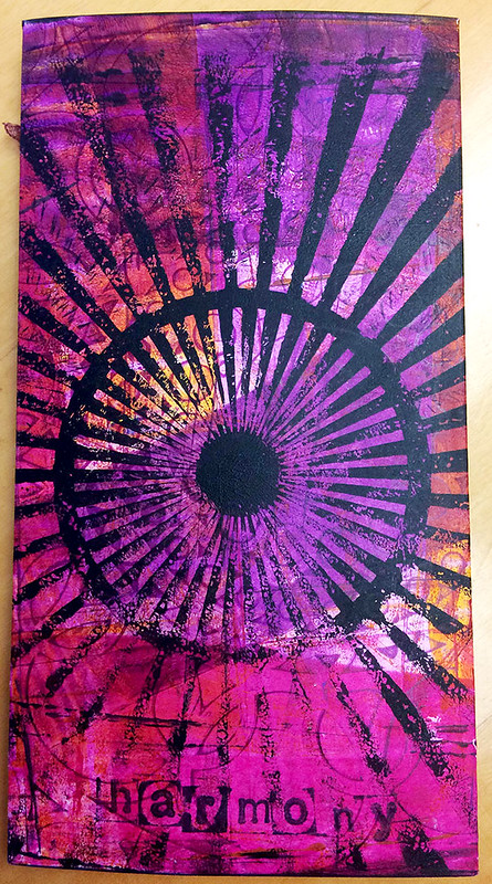
Something i am pretty well known for at this point in my life amongst family, friends and coworkers is making birthday cards for people. Here are a couple i've made the last couple of months.
The above was made using a Gelli Plate and stencils. The back i did up a little differently than usual:
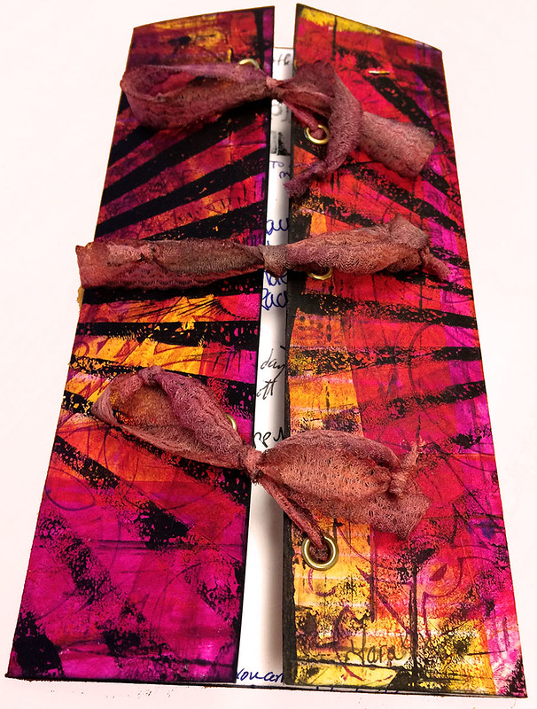
Corset style! All the greetings are exposed when unlaced!
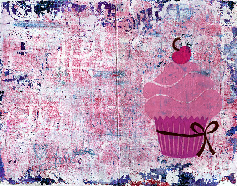
This card is also a Gelli Plate print with a cupcake wrapper glued with soft gel (so it dries completely transparent)
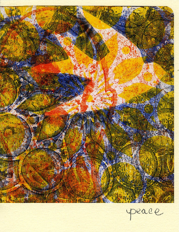
Again a Gelli Plate print with stencils and masks used. This might be one of my favorite yet!
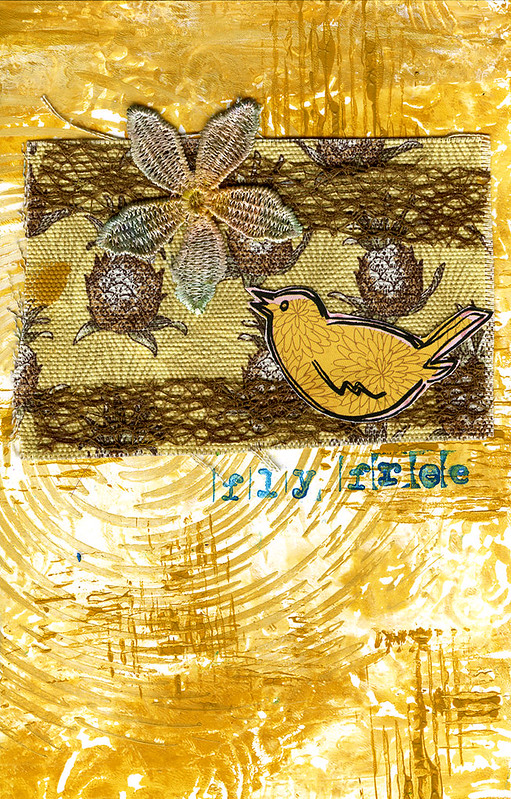
Lastly a Gelli Plate collage for a coworker who was leaving.
Tag :
Gelli Prints,
Greeting Card,
Spring POP Mixed Media
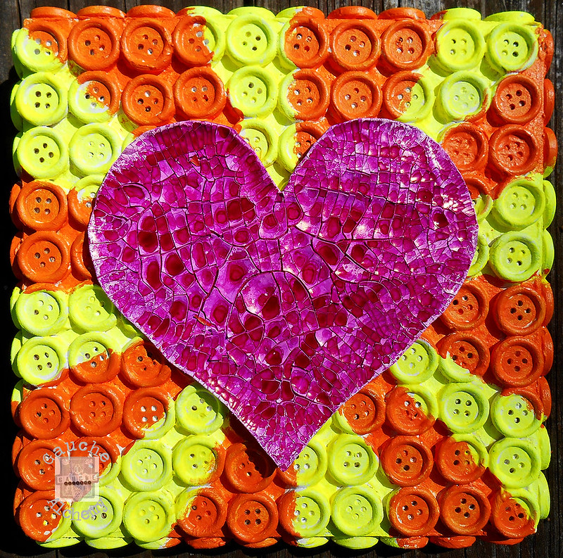
I was inspired by the May Gauche Alchemy mood inspiration board to do something mixed media and BRIGHT. The mood board looks like this:

I ended up making two canvases I was so inspired. The first one i glued a ton of wood buttons on the canvas, gesso'd then painted with neon acrylic colors. The heart is made with Crackle medium and Dylusions ink spray.
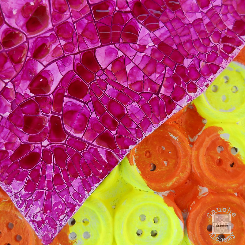
It's pretty amazing affect the ink and the crackle created - looks like a broken pink mirror!
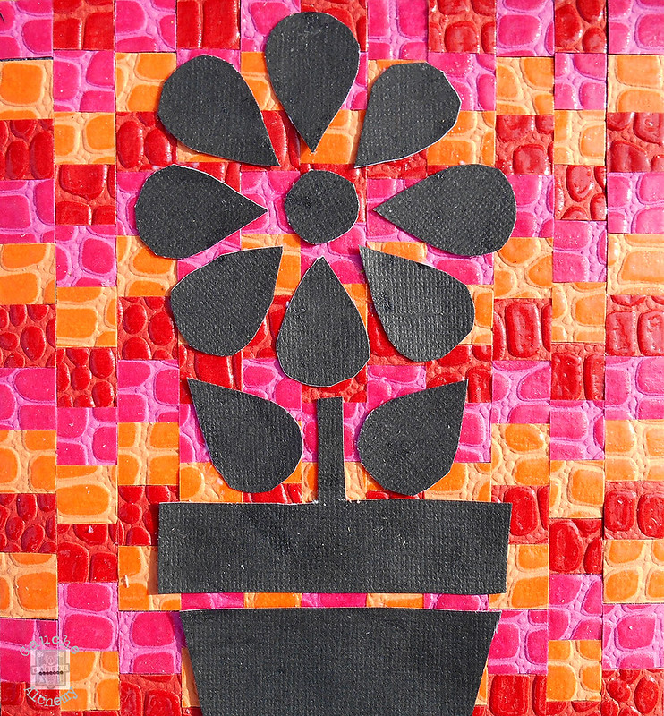
This second project is good old fashioned paper collage.
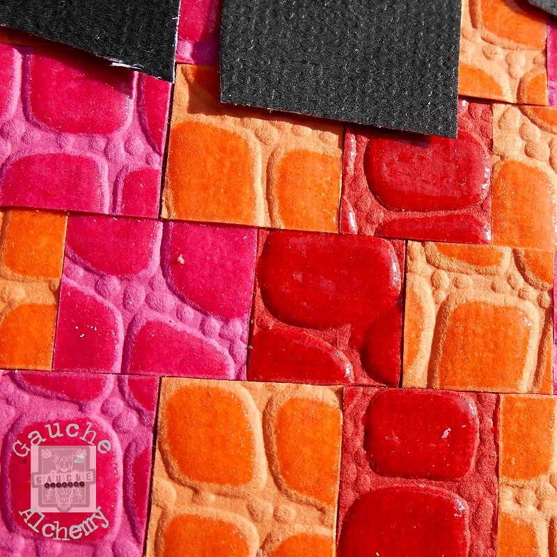
The background paper i bought in a scrap paper bag many years ago and there was just enough to cut into all the little squares and glue on the canvas! The flower is cut out of good old black cardstock.
Documented Life Project Art Journal - More Layouts
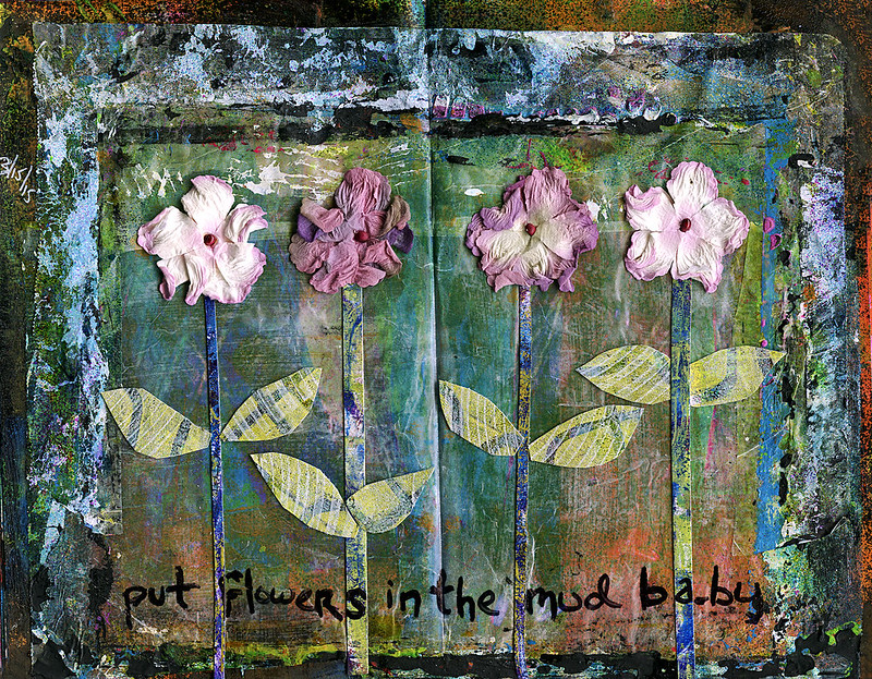
Not sure where to begin with this journal page because i love it so much. I can't believe it turned out better than i ever could have imagined when i started and i've already started "transferring" it to an 18" x 24" canvas.
OK, so this layout was inspired by the challenge over at Documented Life Project:
Art Challenge: Under Paper (paper on your work table that gets all inky while you work) Journal Prompt: What Lies Beneath?
There's a couple of different under paper type things happening on this one that i think resulted in the amazing layers. First, i used the open spread to roll excess paint off my brayer when i was making some Gelli Prints. Over that, however, is wax paper that i've been using between pages of the journal when i work. As you can see it's collected ALOT of excess paint on the sides, so after i glued it down it really formed a frame. I haven't used wax paper as a layer in a very long time and i'm not sure why. It adds depth as well as texture!
Serendipity played a roll in the direction this page took as i was listening to my Spotify U2 mix and the song Zooropa started. I have a very strong attachment to this song and have actually wanted to do an art homage to it at some point but could never quite figure out how to honor it. I listened to it on repeat riding the El Subway in Chicago for hours on end during a very dark time in my life. The darkness of the layout with the hint of light, and then adding the quote pulls it together perfectly.
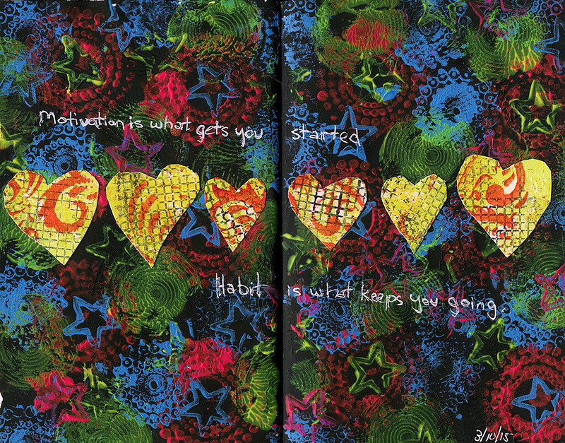
Why, this is another layout i'm quite happy with!
Art Challenge: Repeating Elements
Journal Prompt: It's Worth Repeating
I started this spread out by using Black Gesso to get rid of the blank page. I then chose three stamps and used three color of paints and just stamped, or repeated, across the entire spread. Then i cut a couple of hearts out of some set aside Gelli Prints and voila.
When i thought about the concept "Its worth repeating" i thought about how i've been able to make it a habit to go to the gym 5 days a week for the last couple of months as well as eat better. It's probably the main focus of my life right now. So the quote came from that concept.
Tag :
Art Journal,
DLP,
Documented Life Project - First Journal Pages
In an effort to art journal even more in a way that is actually journalling - i.e. document my life's ups and downs, i've joined the Documented Life Project which is a weekly prompt blog. At first i was stumbling over what to use - to make my own journal, to use loose papers, or buy a journal, and i decided in the end to buy a journal and so far it's working quite well. It appears to be a Moleskine but it's actually made by a company called Stillman & Birn and after three spreads created with a plethora of multimedia items including sprays and lots of mod podge it apears to be holding up better than Moleskine.
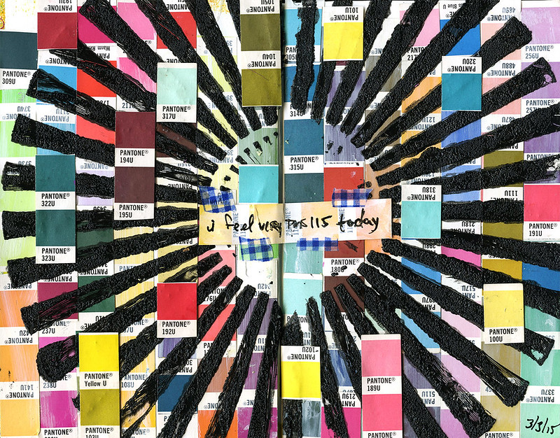 This first spread's Art Challenge is: The Color Wheel
Journal Prompt: "I found I could say things with color and shapes that I couldn’t say any other way . . . “ - Georgia O’Keeffe
I've actually been thinking of doing a page like this for years since i have a small collection of old Pantone books i've collected from various jobs. And since i'm in the graphic industry our language of color revolves around the Pantone Matching System (or PMS) so really it's like my color wheel. Awhile ago i was emailing with a friend, who is also a graphic designer, and i mentioned "today i'm just feeling really PMS 432" which is a dark grey color. We got a good laugh out of what nerds we are and it kind of became a thing to every so often call out what PMS spot color we were feeling that day. The day i made this spread i was feeling OMS 115 - a bright yellow. Good day :)
This first spread's Art Challenge is: The Color Wheel
Journal Prompt: "I found I could say things with color and shapes that I couldn’t say any other way . . . “ - Georgia O’Keeffe
I've actually been thinking of doing a page like this for years since i have a small collection of old Pantone books i've collected from various jobs. And since i'm in the graphic industry our language of color revolves around the Pantone Matching System (or PMS) so really it's like my color wheel. Awhile ago i was emailing with a friend, who is also a graphic designer, and i mentioned "today i'm just feeling really PMS 432" which is a dark grey color. We got a good laugh out of what nerds we are and it kind of became a thing to every so often call out what PMS spot color we were feeling that day. The day i made this spread i was feeling OMS 115 - a bright yellow. Good day :)
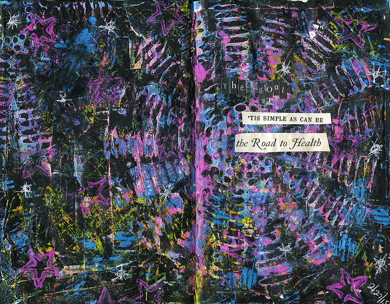 This spreads Art Challenge: Book Paper
Journal Prompt: Be Your Own Goal Keeper
Wow, this spread really went ALL OVER THE PLACE until i finally called it done. You can't really tell, but it started out with a layer of book paper glued to the blank page. Though you can't see the printing on the paper anymore, you can still see some of the texture it left from where i tore it and glued it. There's a whole crapload of layers on this thing - i kept not liking outcomes and tried to cover it up. There's some light molding paste through a stencil, also some gesso slapped on there, so in real life there's actually a ton of texture. But then i kind of just went ballistic with Dylusion Sprays and stamps and when it looked i couldn't save it no more, i took a brayer with some black acrylic paint on it and rolled it over the top. Because of all the texture from the Gesso and paste it didn't go on evenly letting paint show through the vally's. To pull a little more color out i scraped some of the black off also, then stamped a little on top. To finish it off i took these two quotes i had cut out from magazines to dictate my current goal which is ALWAYS on my mind, and it sounds simple buy holy shit is it not - health. Physical health, mental health.
This spreads Art Challenge: Book Paper
Journal Prompt: Be Your Own Goal Keeper
Wow, this spread really went ALL OVER THE PLACE until i finally called it done. You can't really tell, but it started out with a layer of book paper glued to the blank page. Though you can't see the printing on the paper anymore, you can still see some of the texture it left from where i tore it and glued it. There's a whole crapload of layers on this thing - i kept not liking outcomes and tried to cover it up. There's some light molding paste through a stencil, also some gesso slapped on there, so in real life there's actually a ton of texture. But then i kind of just went ballistic with Dylusion Sprays and stamps and when it looked i couldn't save it no more, i took a brayer with some black acrylic paint on it and rolled it over the top. Because of all the texture from the Gesso and paste it didn't go on evenly letting paint show through the vally's. To pull a little more color out i scraped some of the black off also, then stamped a little on top. To finish it off i took these two quotes i had cut out from magazines to dictate my current goal which is ALWAYS on my mind, and it sounds simple buy holy shit is it not - health. Physical health, mental health.
 This spreads Art Challenge: Gesso
Journal Prompt: “The beginning is always today.” -Mary Shelley
Another multi-layered one. And i learned something super duper valuable!!! I started the page out by putting Gesso through stencils. I've done that before, however what i had NOT done before, was then spray over it after it was dry with Dylusions Ink Sprays. it deflected the spray! Needless to say i will be using this technique mucho more times. After the first layer of spray i took another stencil and sprayed over that with some other colors. Then i took some acrylic paints and stamped on it and finally took some Gesso and spread it across the middle so i could write something without it being too obscured. The Gesso picked up some of the spray which is how it turned blue. Obviously the quote is from the prompt but really made it come alive was that morning i had decided to try a yoga class at the gym. It centered me nicely, actually, and just reminded me too live in the present, today.
This spreads Art Challenge: Gesso
Journal Prompt: “The beginning is always today.” -Mary Shelley
Another multi-layered one. And i learned something super duper valuable!!! I started the page out by putting Gesso through stencils. I've done that before, however what i had NOT done before, was then spray over it after it was dry with Dylusions Ink Sprays. it deflected the spray! Needless to say i will be using this technique mucho more times. After the first layer of spray i took another stencil and sprayed over that with some other colors. Then i took some acrylic paints and stamped on it and finally took some Gesso and spread it across the middle so i could write something without it being too obscured. The Gesso picked up some of the spray which is how it turned blue. Obviously the quote is from the prompt but really made it come alive was that morning i had decided to try a yoga class at the gym. It centered me nicely, actually, and just reminded me too live in the present, today.
This first spread's Art Challenge is: The Color Wheel
Journal Prompt: "I found I could say things with color and shapes that I couldn’t say any other way . . . “ - Georgia O’Keeffe
I've actually been thinking of doing a page like this for years since i have a small collection of old Pantone books i've collected from various jobs. And since i'm in the graphic industry our language of color revolves around the Pantone Matching System (or PMS) so really it's like my color wheel. Awhile ago i was emailing with a friend, who is also a graphic designer, and i mentioned "today i'm just feeling really PMS 432" which is a dark grey color. We got a good laugh out of what nerds we are and it kind of became a thing to every so often call out what PMS spot color we were feeling that day. The day i made this spread i was feeling OMS 115 - a bright yellow. Good day :)
This spreads Art Challenge: Book Paper
Journal Prompt: Be Your Own Goal Keeper
Wow, this spread really went ALL OVER THE PLACE until i finally called it done. You can't really tell, but it started out with a layer of book paper glued to the blank page. Though you can't see the printing on the paper anymore, you can still see some of the texture it left from where i tore it and glued it. There's a whole crapload of layers on this thing - i kept not liking outcomes and tried to cover it up. There's some light molding paste through a stencil, also some gesso slapped on there, so in real life there's actually a ton of texture. But then i kind of just went ballistic with Dylusion Sprays and stamps and when it looked i couldn't save it no more, i took a brayer with some black acrylic paint on it and rolled it over the top. Because of all the texture from the Gesso and paste it didn't go on evenly letting paint show through the vally's. To pull a little more color out i scraped some of the black off also, then stamped a little on top. To finish it off i took these two quotes i had cut out from magazines to dictate my current goal which is ALWAYS on my mind, and it sounds simple buy holy shit is it not - health. Physical health, mental health.
This spreads Art Challenge: Gesso
Journal Prompt: “The beginning is always today.” -Mary Shelley
Another multi-layered one. And i learned something super duper valuable!!! I started the page out by putting Gesso through stencils. I've done that before, however what i had NOT done before, was then spray over it after it was dry with Dylusions Ink Sprays. it deflected the spray! Needless to say i will be using this technique mucho more times. After the first layer of spray i took another stencil and sprayed over that with some other colors. Then i took some acrylic paints and stamped on it and finally took some Gesso and spread it across the middle so i could write something without it being too obscured. The Gesso picked up some of the spray which is how it turned blue. Obviously the quote is from the prompt but really made it come alive was that morning i had decided to try a yoga class at the gym. It centered me nicely, actually, and just reminded me too live in the present, today.Tag :
Art Journal,
DLP,
Found Object Art - Pieces of my Heart
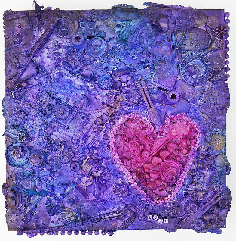
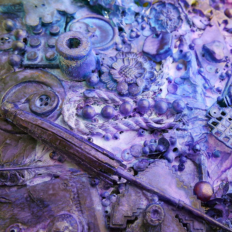
This month Gauche Alchemy's mood board was about February and the month of love and stuff. The project i made for the challenge showed my personal take on my journey of teaching myself to love myself.
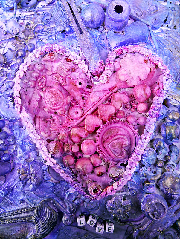
Read about my process and see more photos over at Gauche Alchemy!
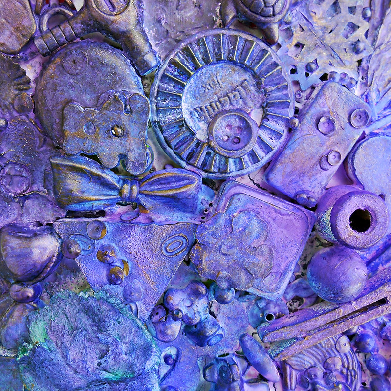
Art Journal - Growth and Motivation
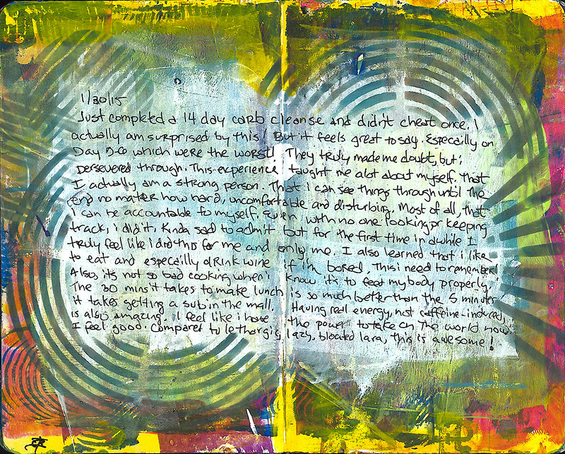
A couple of recent art journal pages ... appears i've been doing alot of self reflection about my health the last couple of months!!
This is a rarity in my art journal - rarely do i write out words like this but i just needed to get it down like a diary cause images may not remind me in the years to come all the things i wanted to say!
Seems like such a "plain" page for me even though there are several layers of paint and stencils and ink!
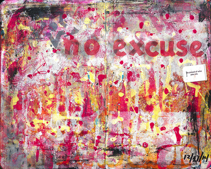
This one is a particularly smelly one, and although the look of nail polish splattered on a page looks pretty darn awesome, the after smell is pretty rank and doesnt really seem to go away... note to self!!!
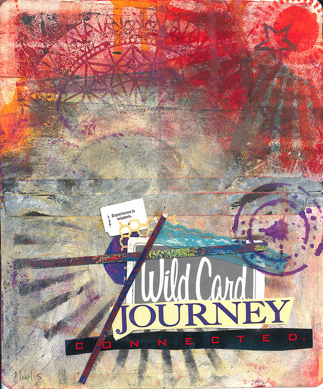
I had no idea what this was going to be as i was adding elements until somehow these certain word strips just kind of came to the top of the pile. I realized what a journey the last couple of years have been. pretty unpredictable, very educational... for some reason this page really makes me think of the Chemical Brothers song "The Golden Path"
"As I walked along
The supposed golden path
I was trembling with fear
Oh, the lions and the wizards yet to come
I seen in the distance
Silver mountains rising high in the clouds
And a voice from above did whisper
Some shining answer from the moon"
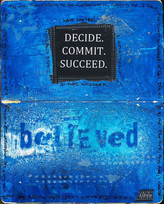
Just some words of inspiration found on pinterest and taken to heart to get my ass moving!
Tag :
Art Journal,
Seasons Greetings Cards
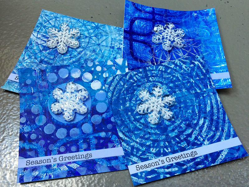
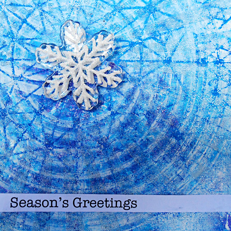
This years cards were made with, you guessed it, a Gelli Plate and some plastic snowflakes i picked up at the Scrapbox in Ann Arbor.
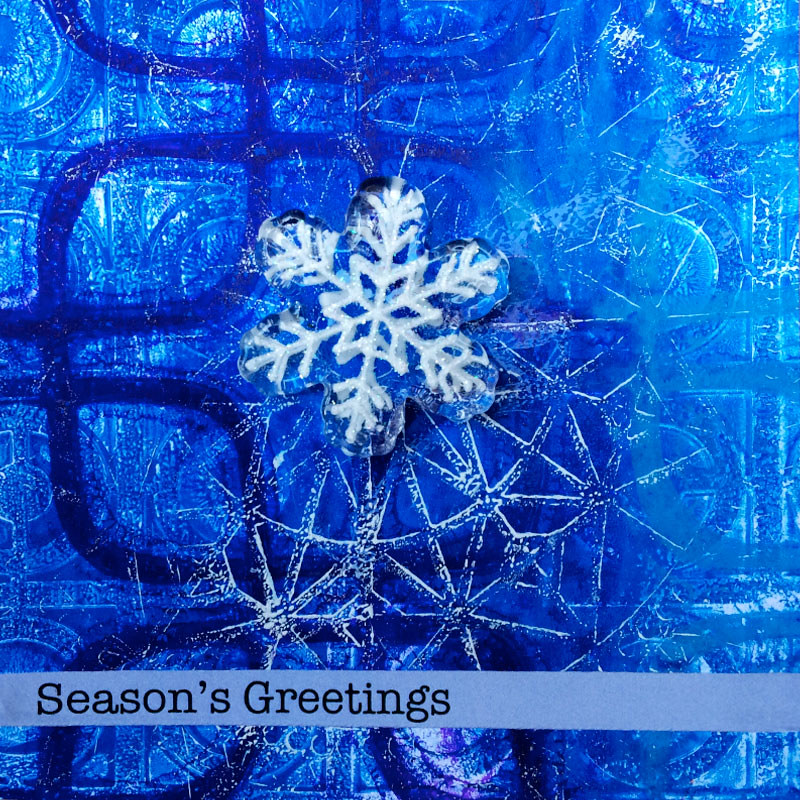
Layers and layers of blues and white acylic paint with layers and layers of stencils!
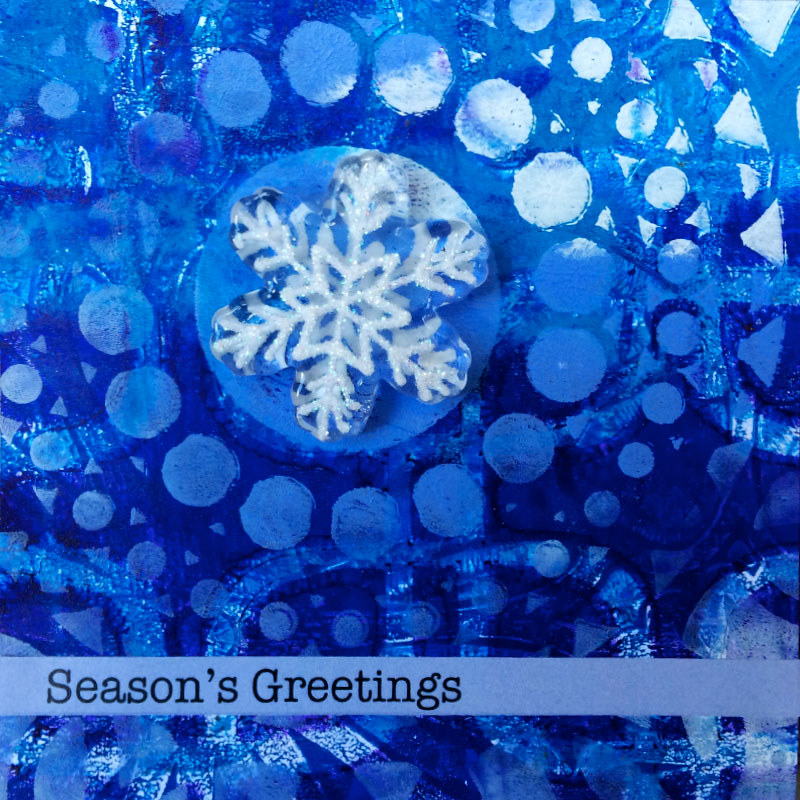
This was the first time i really used the technique of printing on a full sheet of paper then finding the 4" x 4" section that was most interesting and cutting that out. It used more paper and produced more scraps then i'm really comfortable with, but it also was good training for really seeing the details in things.

Tag :
Gelli Prints,
Greeting Card,
50th Anniversary Scrapbook Present
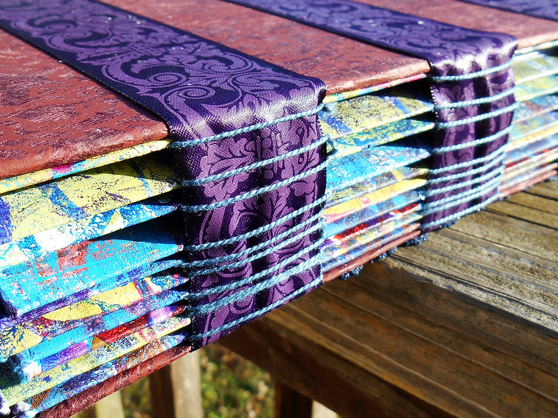
For my parent's 50th wedding anniversary i made a scrapbook of photos from their 50 years together. I wanted to give them something special and meaningful. I remembered that the best present i have ever received was from my parents on my high school graduation - a handmade scrapbook. As it turned out, this was absolutely the perfect gift.
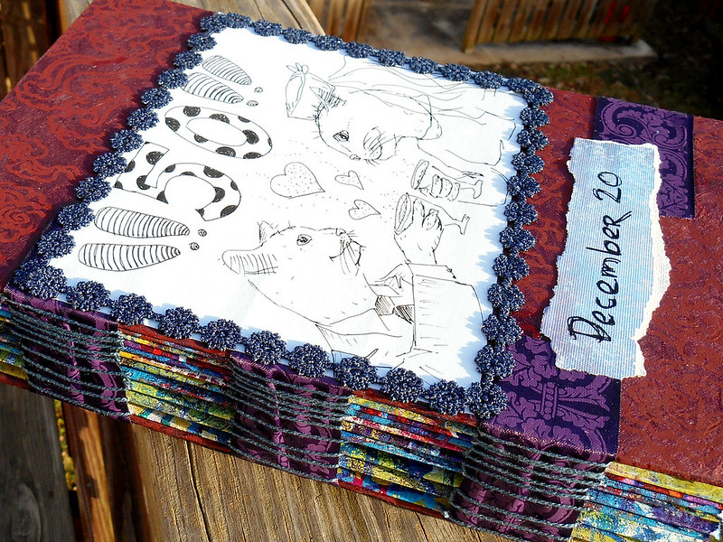
The covers are chipboard i covered in a fibrous handmade paper. My brother drew the picture that i framed with ribbon on the front cover. The back cover is simple, with the ribbon used to bind the book visible.
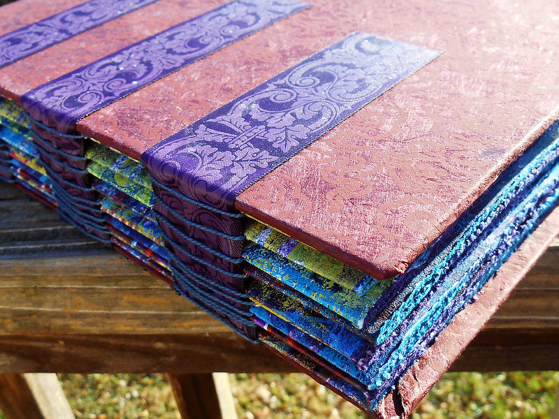
The binding i chose is called Tape Binding even though there is no tape involved. Confusing name. I wanted to choose something simple and unintrusive, since i had never bound anything before, and that looked elegant. This looks awesome, but for such a substantially heavy book i probably should have chosen something a bit stronger.
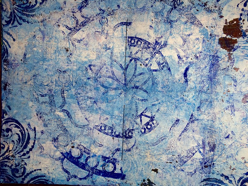
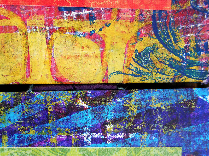
The inside pages are heavy weight watercolor paper i used to make Gelli Plate prints on. There are 10 sheets i printed on front and back.
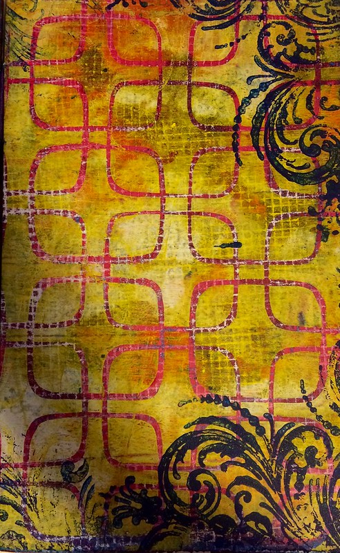
I used many colors, whatever i was feeling like that day really. This yellow and pink print ended up being my favorite even though it's so bold.
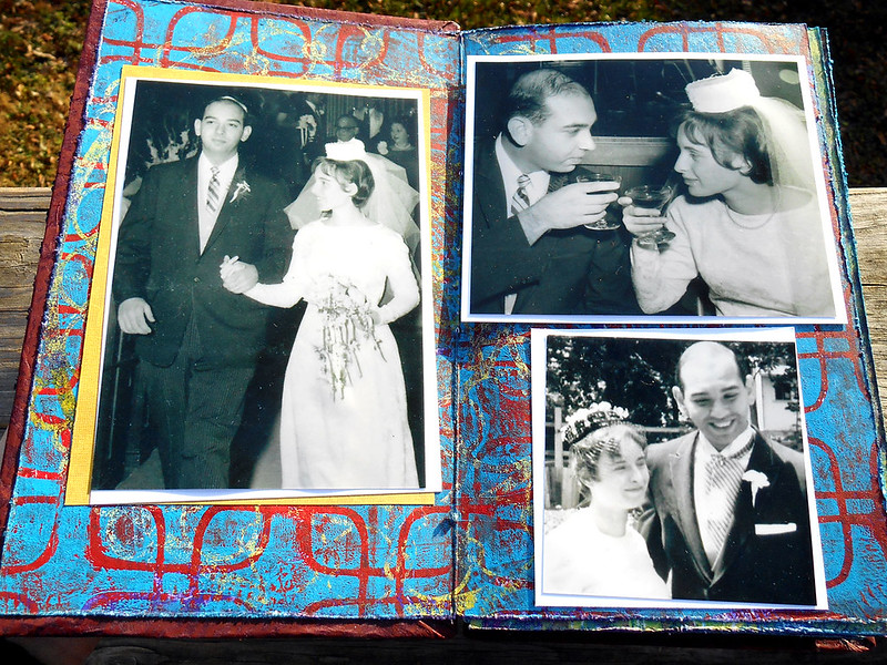
To mount the photos i used regular scrapbook paper, trying to coordinate colors.
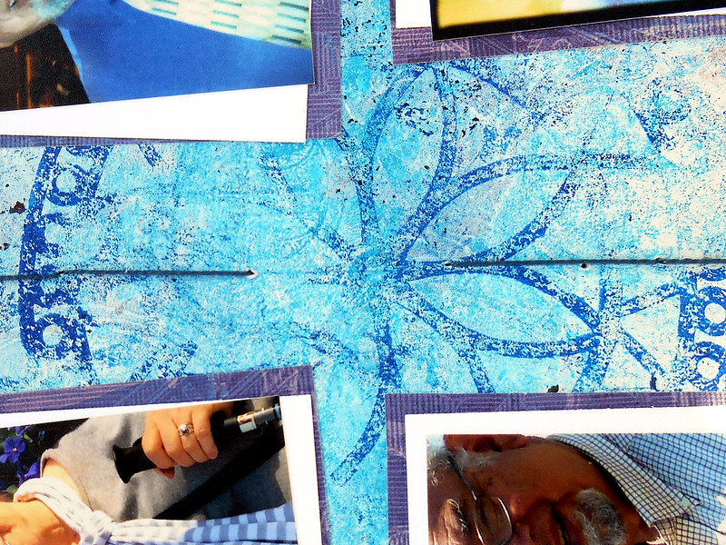
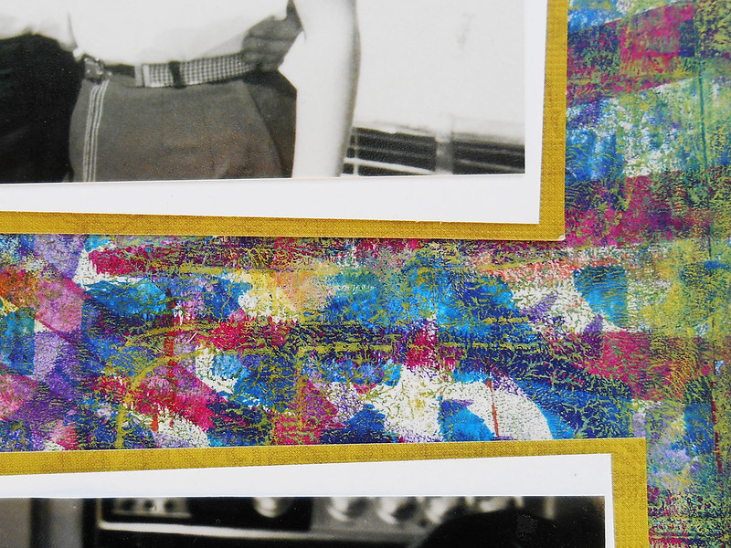
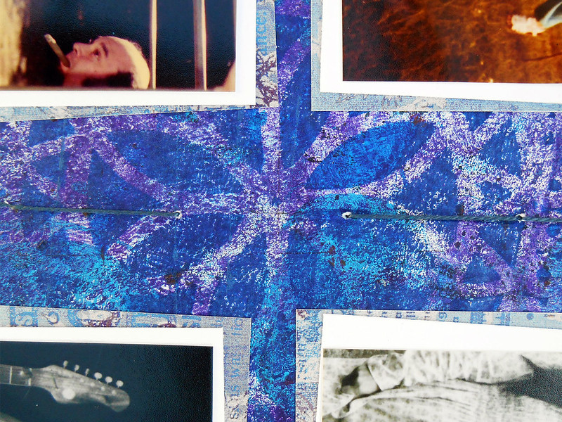
The page edges were distressed and inked with distress inks.
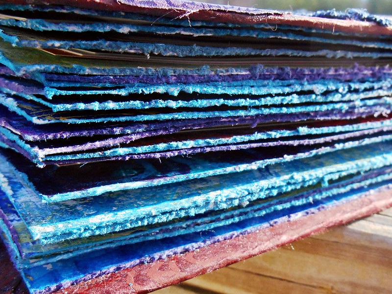
All in all this turned out better than i could imagine! I know it was appreciated by my entire family!
Tag :
Gelli Prints,
Gifts,
Travels with Gelli

I love how portable Gelli Plates are. In my carry on bag I was able to easily fit the plate, a brayer, 3 2oz paints and some stencils.
Even though it's grey and cold here in Michigan, the porch at my parents house is enclosed and with a portable heater nice and toasty. Feels awesome to be working in this overcast light actually.
Tag :
Gelli Prints,
Dance Like No One's Watching Mixed Media
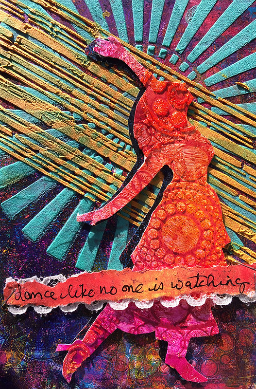
A co-worker of mine who has seen a few of the cards i make for friends asked if she could commission me to make a birthday card for a friend of hers. After some thought i accepted which planted a little seed of idea in the old mind grapes...
Anyways, i asked her what her friend likes to do and colors and she said she likes to dance and loves bright colors... and this is what i came up with!
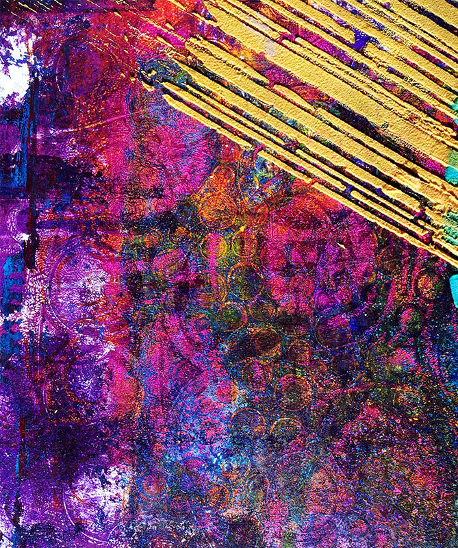
The background is gelli plate printing. This is one of those "throw away" prints i thought sucked because it was too busy and i just completely over did it, but good thing i've learned to never throw anything away because it worked perfectly as a backdrop for the other imagery i put on it!
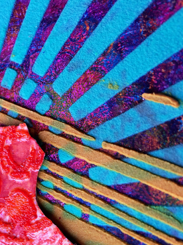
See? The subtle design blends into the back as i layered light molding paste mixed with color pigments through stencils over the top. I actually dont believe i've ever done two layers of stencils with molding paste and since i let the first dry completely it worked like a charm!
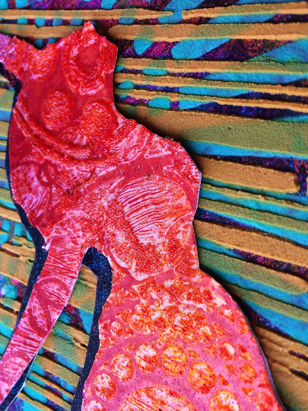
The dancer was created using my, now, coveted, technique of glass bead gel and dylusions ink spray. I think i found my niche y'all! I also cut up another "throw away" gelli print to put as a shadow behind the silhouette adding extra depth and layer.
To finish it all off i added one of my all time favorite quotes (handwritten!!!!) and used the staples in double duty - to adhere the piece as well as provide a bit of a border/stop for the eye.
So, yeah, i'm thinking of taking commissions for more cards now. It's fun being stretched, and really i have discovered i am most inspired when i am creating something for someone specific.
More to come....????
Tag :
Gelli Prints,
Greeting Card,
Owl Birthday Card
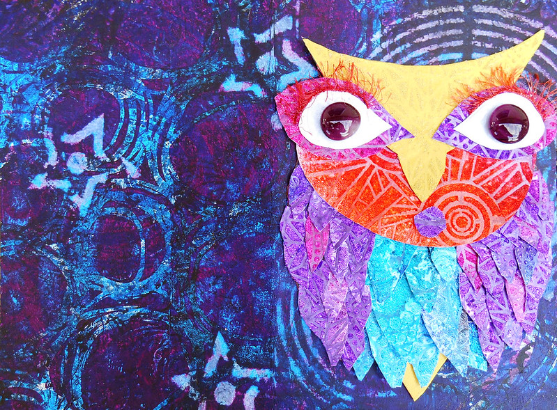
This project is featured over at Gauche Alchemy today!
Me so love Golden Glass Bead Gel + Dylusions Ink Spray!
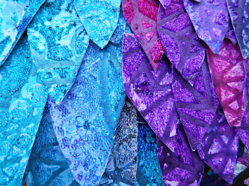
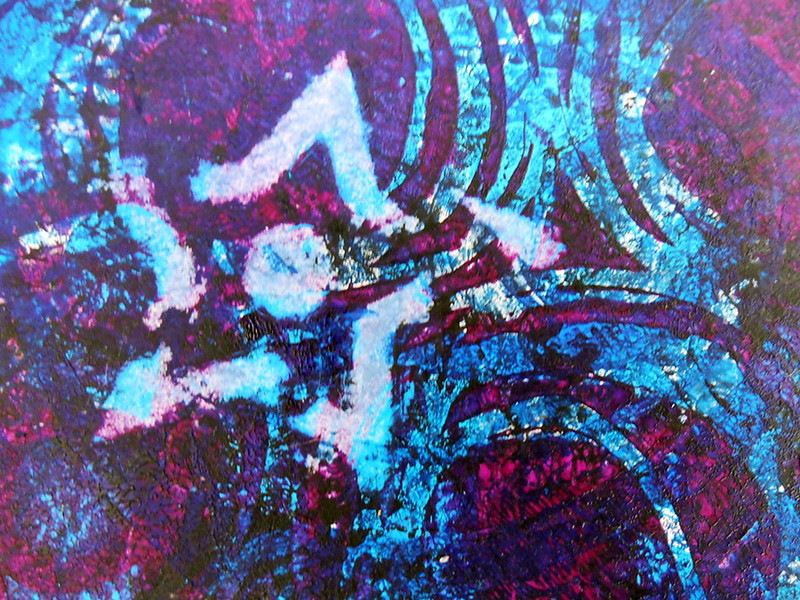
And me so love Gelli Printing and Stencilling!
LOVE!
Tag :
Gauche Alchemy,
Mixed Media,
And More Art Journals
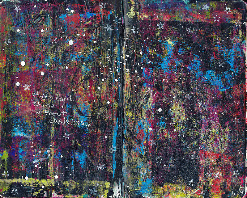
This is one of my favorites now. I found this quote one day on facebook and already had the background done without the white splotches and start stamping. When i saw the quote i knew where it had to live. And it rings so true for me. The balance of life, experiences, emotions. I love the way the colors are dark with peaks of bright.
I finished it off with the white splotches with the Dylusions Spray Ink in White. Worked perfectly!
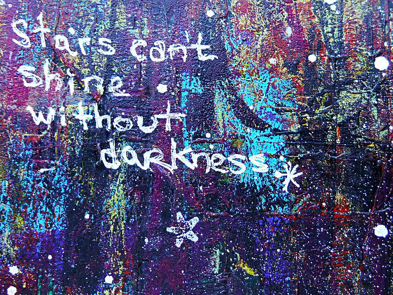
All the paint layers added some really interesting texture!
Obviously, Im still loving these painted layer backgrounds i've been exploring.
90% are made from cleaning my brayer between Gelli plate layers :)
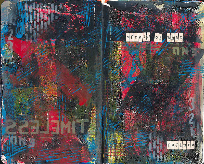
A topic i keep revisiting is fear, and on this day it occurred to me one of biggest fears on a day to day basis (besides snakes and a loved one dying) is failure. I feel like i am constantly working towards something successful but quit at the last minute. Am i afraid to succeed or fail is the question. Seth Apter's stencils pulled this one all together.
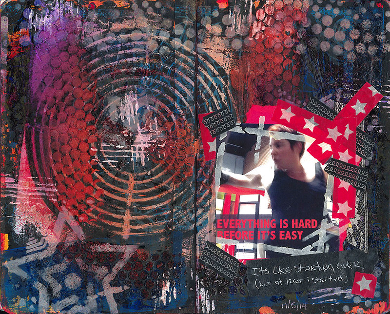
The background on this page truly is a catch all for cleaning my shit off. Whether is be cleaning a stencil of extra paint, using excess paint through some punchinella or another stencil so not to waste it. its been a couple of months in the making and was so dark and chaotic i didnt know how i could ever use it.
For the last two months i've been sidelined by some internal health issues which has basically put me back at step zero at the gym. And i was doing really well for about six months, going to bootcamps 3-4 times a week. But now that i am starting back i find i have lost so much of my strength and conditioning. Like an insane amount of conditioning and it feels horrible and some days even impedes me from wanting to get up and work out.
I took some photos of myself boxing to see just how crappy i look and whether it looks like a joke that i am even attempting to box, but after i saw a couple of the photos (not all mind you), i thought to myself "this fatty can kick some ass!" I got on pinterest as i have been doing to look for motivational fitness quotes and found the perfect one for where i am at "everything is hard before it's easy" because thats exactly how it feels every time i step foot into the gym. I made my own meme with one of the boxing photos. And so it wouldnt just live on my computer or on facebook, i printed it and incorporated it into this page. That target in the center works perfectly.
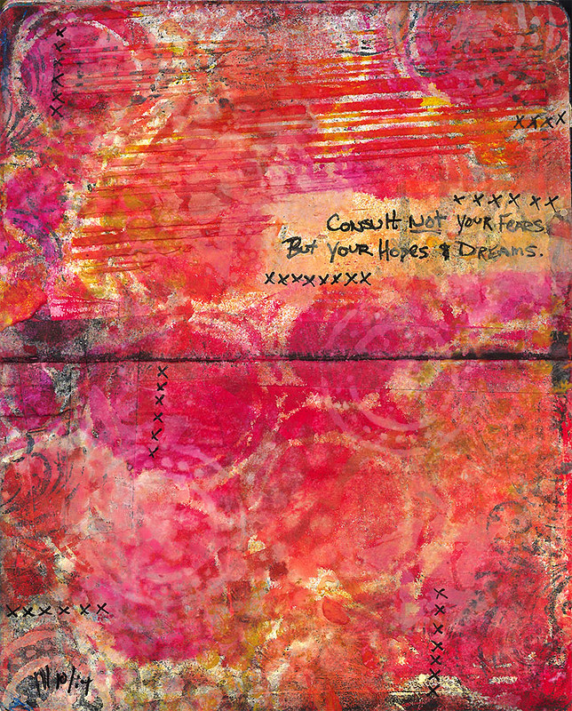
Lastly a vertical page, which i rarely rarely do! This was mostly to test out the Dylusions sprays through different stencils. Again, the words jumped out at me one day and i wrote them down to remember them. I was able to mask the area off and stencil around them. Again, with the fear... but more importantly ... again with the hopes and dreams!
Tag :
Art Journal,
