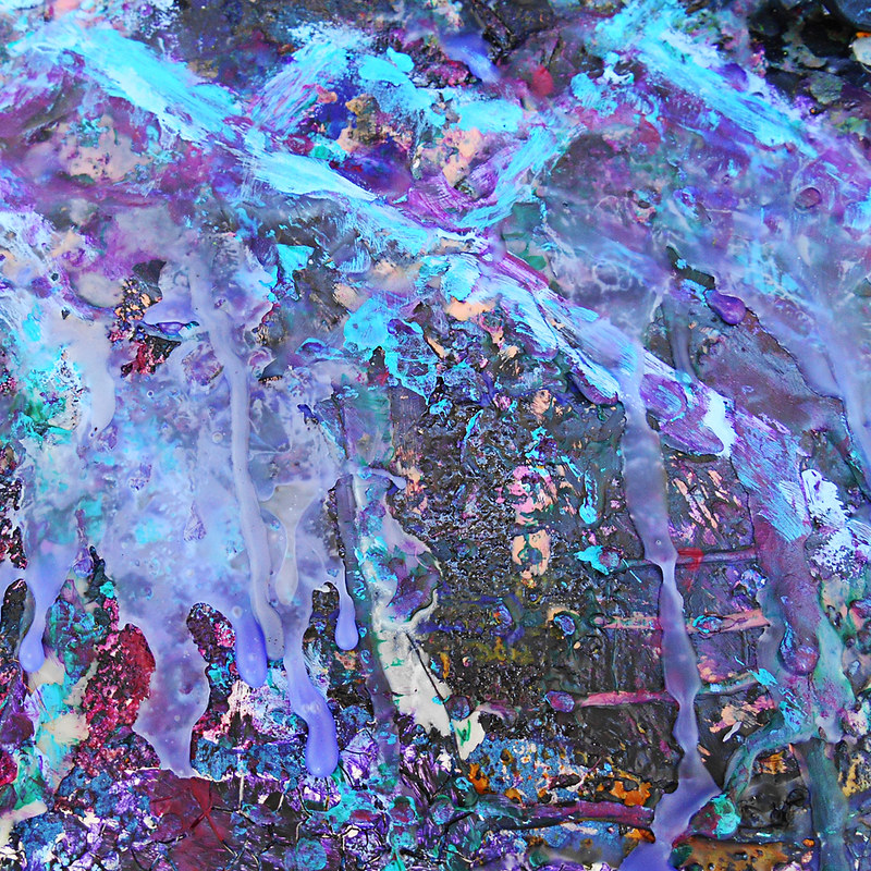
2020 Card for Bono's Birthday
2020 Card for Bono's Birthday.
Inspired by one of my favorite U2 songs, City of Blinding Lights.
The quite "time won't leave me as I am..." runs through my head constantly.


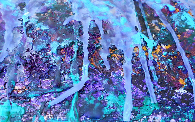
2019 Birthday Card for Bono
Made from bits and pieces... everything that connects our heart throughout the struggles and successes in our lives.


2018 Bono Birthday Card
This years card was so much fun and so rewarding to make! I usually don't make literal art, but I was inspired this year by U2's Experience and Innocence tour and the use of the "home" theme throughout. U2 have a song, Cedarwood Road, written about Bono's childhood, that I used as a basis. So, no I am not stalking when i googled images of it!

2017 Card for Bono's Birthday
2017 Card for Bono's Birthday: We Need New Dreams Tonight
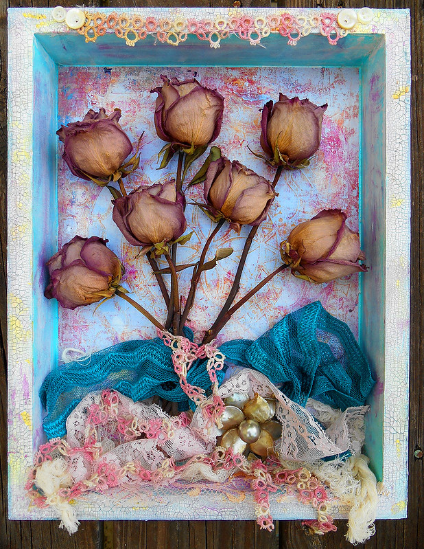
This is one of my favorites although photos don't do it justice whatsoever which is a disappointment. This is a picture box (made from a real plastic photo frame btw) with some "trash" from my collection juxtaposed against some pink desert roses.
The song lyric inspiration came to me at a May show during God's Country, honestly not one of my favorite songs, but the lyrics hit me like a ton of bricks and I couldn't get it out of my head for days.


For past cards, check out this link.
2016 Bono Birthday Card


For past cards, check out this link.
2015 Creative Retrospective - or stuff i done did.
This was a hard year of ups and downs, the 2nd half, mostly downs. While i was not prolific by any means i did create a couple of things i'm pretty proud of:
2015 Holiday Cards
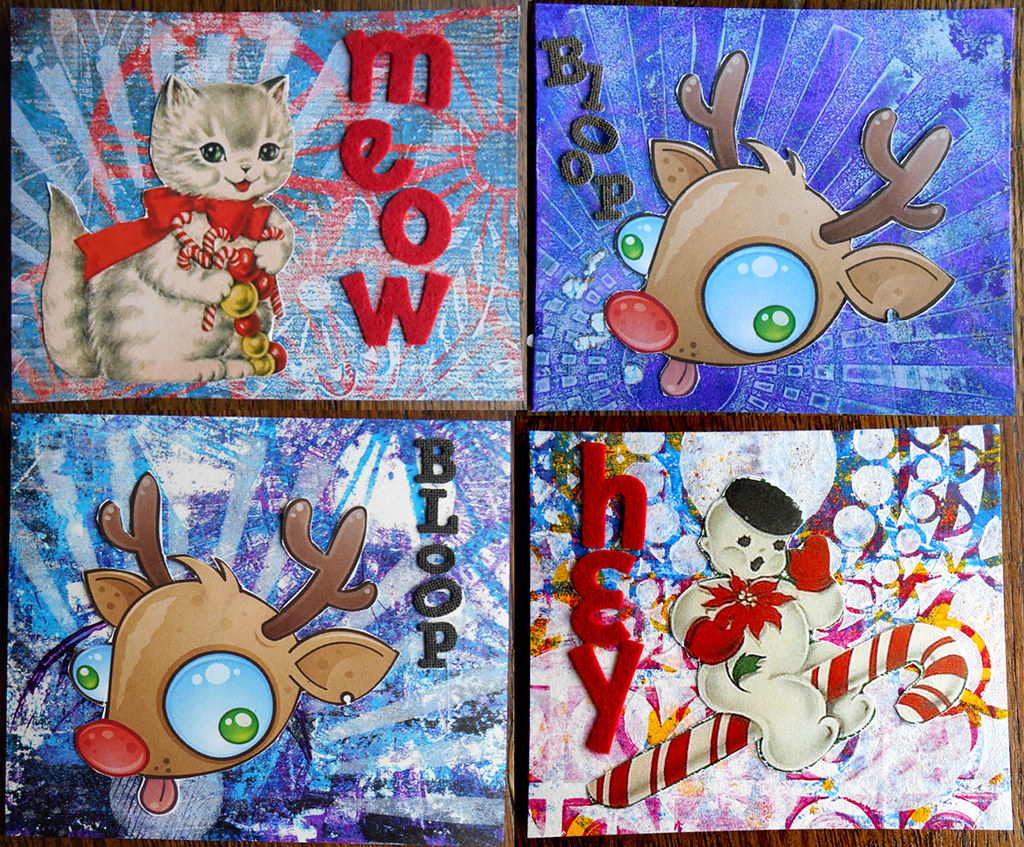
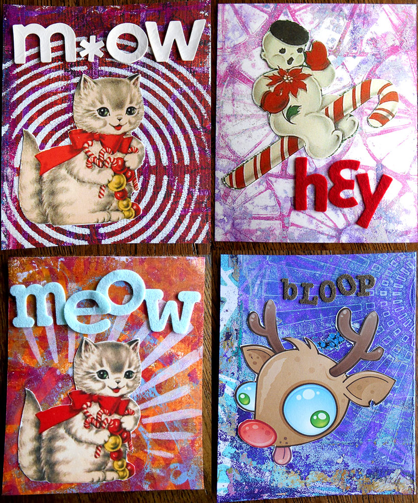
This year, to keep from design fatigue, i made three different holiday cards for people - the kitty and snowman are images from old vintage christmas cards i found on the internet, and the crazy reindeer is from a stock photo site.
For the backgrounds i went through my huge stash pile of gelli prints and found some that looked much better cut into smaller pieces than they did at their original size. Again, reminded to never throw those away no matter how ugly they might look!
Once i matched up the image with the print i did add some more gelli or stamped layers to get the card a little more pulled together.
Topped them off with alpha stickers i've collected throughout the years. Seriously, some of these are at least 15 years old! And as i was running out of certain vowels I found ways to substitute for them - like a three for an e (that rhymes!) and a zero for an o (kinda rhymes?).
and .... voila!
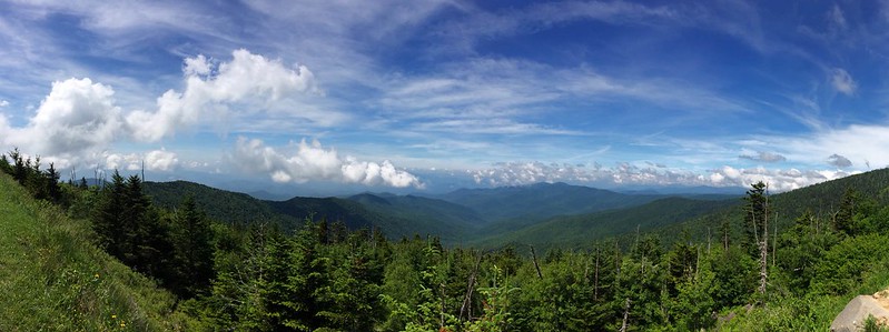
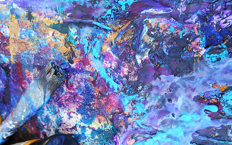
Homage to Smoky Mountains Mixed Media
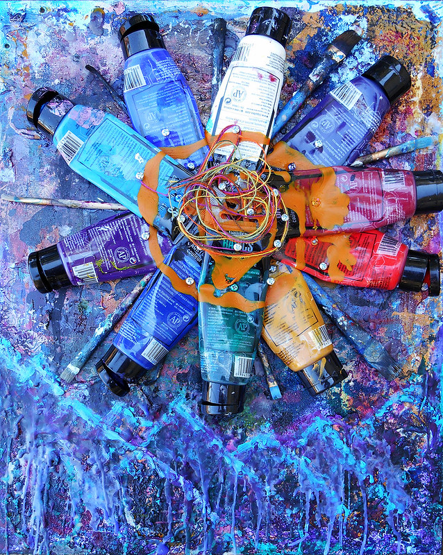
This month's challenge at Gauche Alchemy is vibrant technicolor. I pulled out my paints, and threw some used up tubes into a box i keep the used up paint. Looking at the color palette in the box of old tubes, it drew to my mind the mountains in North Georgia, Tennessee and North Carolina. Whenever i visit the smokies i can just feel my whole being let go and relax.
Some of the most magical times in these mountains are the sunsets and sunrises. And the different colors and textures at those times of day.
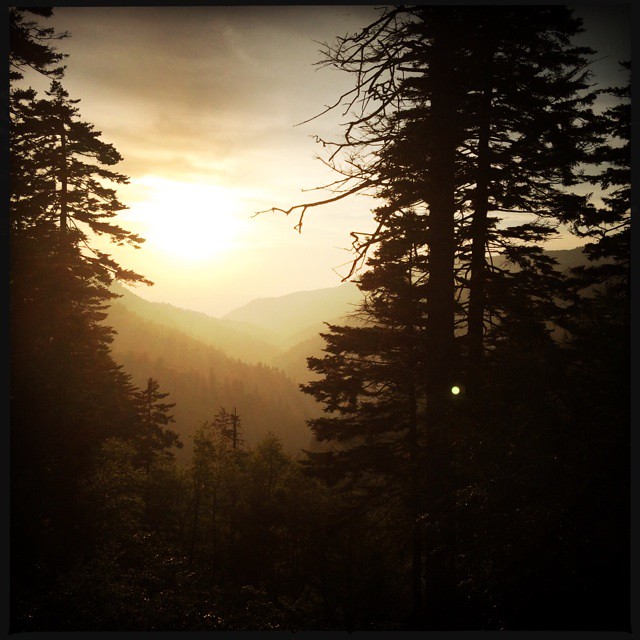
(taken in Tennessee in the Cherokee Forest)
So, with this piece, I wanted to pay homage to some of these textures, layers and colors and my memories of them. I put the tubes into a sun pattern and instead of adhesive used nails to attached them to the wood canvas. The nails also help represent the rustic ambiance throughout that area. On top of the tubes, to pull them together, i swirled some paint and thread.
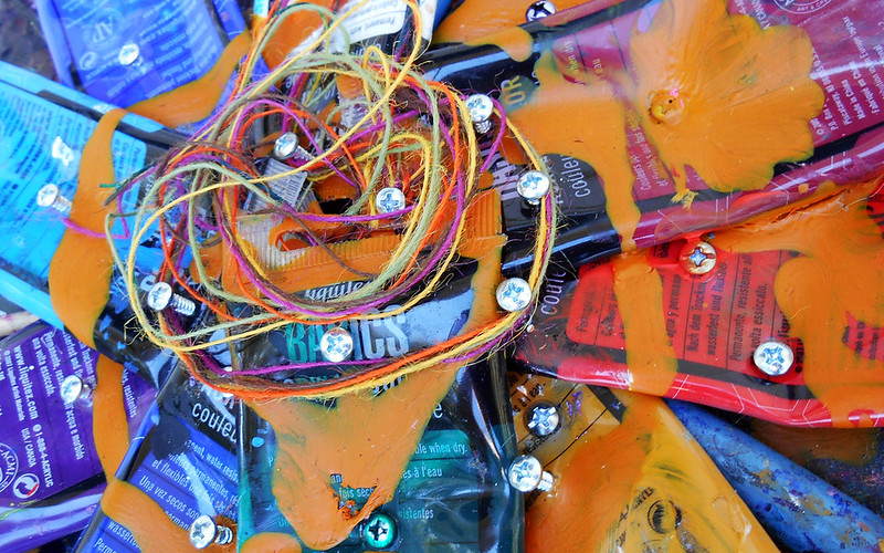
To me this represents the smoky part ;)
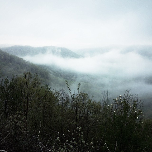
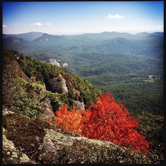
(from Saluda, North Carolina)
Underneath the sun i built up layers and layers of acrylic paint, wax, crackle medium and other bits. The canvas I used is one that I've had for a couple of years. I had put it under other projects i was working on at different times and used it to wipe off old paint and different texture mediums - nothing goes to waste in my studio!
As you see, I tried drawing some shapes to define some abstract mountains. This photo I took in Tennessee near Gatlinburg in the spring:
And this photo is from N. Carolina on White Mountain in the early days of Autumn.
I did add some additional color to the palette, even though there was already much there from previous projects. But wanted to put in ALL the technicolors Mother Nature paints our world with on this piece.
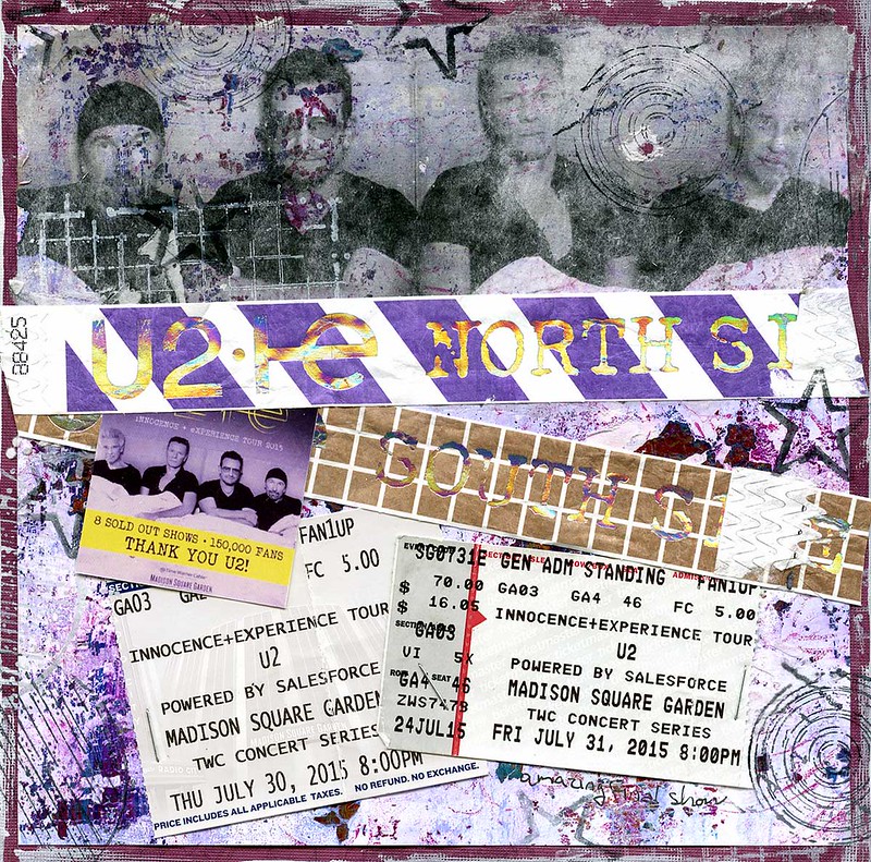
The Start of a new scrapbook / U2 in NYC
However, i wanted to post these pages on my private blog to write some more in depth memories each page brings up. I plan to then print this out and put it behind the layouts in the scrapbook sleeves. 8" x 8" only has so much room!
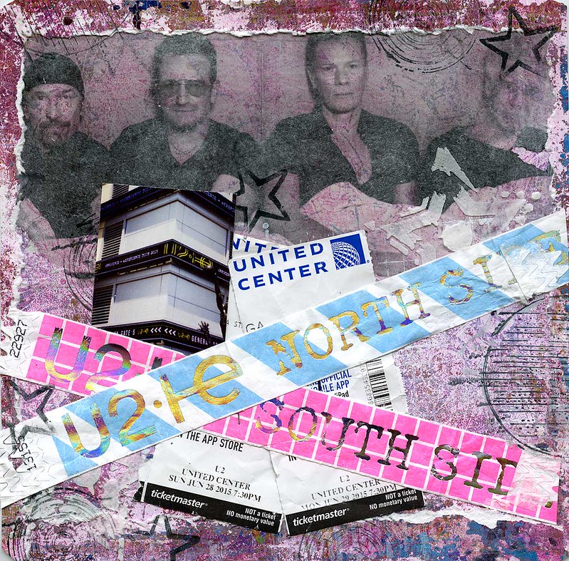
The first sets of shows i went to were in Chicago at the United Center. It was strangely familiar as i've seen so many shows over the years i lived in Wisconsin there, including a handful of u2 shows. The GA line area hadn't changed at all in 15 years! Same grassy knoll and public housing building that didn't look like it had been updated at all since last i was there circa 2002 i believe.
I met several friends, old and new, and we stayed at a house near by. I got in the day before the first show and we did some sight seeing. Then the day of the show woke up early (6:15am early) to go "check-in" in the GA line. For those who don't know, U2 GA lines are SERIOUS business. There are rules and regulations, all fan enforced, and there are check-ins starting 24 hours before the show. If you don't show up to 1 of the 4 you're booted to the back! Thankfully, i was with line pro's who showed me the ropes and we were all in the top 25 to the front.
After checking in we decided to "stalk" the band. We all had various reasons why. And these pro's i was with knew where to go. But more on this later...
The SHOW. The WHOLE reason for this mini-vacation!
The stage set up for this tour is pretty spectacular - for any sort of fan. The people I was with had seen many shows and knew the best places. So the first night we stood by the "B" stage which is where the band performs about a third of their show and it's mostly stripped down versions of the songs. The second night we were up by the main stage which is a whole different experience and truly neither is better than the other one. I must give a slight edge to the place we stood at by the main stage because Bono's voice sounded so crisp and clear there - there must have been a dedicated speaker there or something.
I adored being up close for all the shows i saw. You got to see what professionals these guys are. Yet they are still able to create an intensely personal show. Especially being at the B stage which felt quite intimate. You could see all the cues, all the band communication, all the humanism. I loved how on newer songs Bono had to read the lyrics off a MacBook screen!
Anyways things that really knocked me out about these shows and setlists.
First, Bullet the Blue Sky. For a song that came out in the late 80s they always seem to give it a new life with every tour and this is no different - it's INTENSE. Like leave your body and drive you mad out of your mind intense. Bono really works through some white guilt during the IE version arguing with himself about becoming an American and not recognizing the person he's become. Just. Just.
Every Breaking Wave is another standout performance. It wasn't until i heard this song stripped down to piano and voice did i pay it any attention and thank god the band decided to take it to that level - it's beyond words how gorgeous that song is. And Bono puts SO MUCH emotion into the performance its hard not to be transcended with him. In fact, in NY the last night it literally brought tears to my eyes and made my knees so weak i was thankful to have a railing to grab a hold of.
So something else lovely happened in NYC:
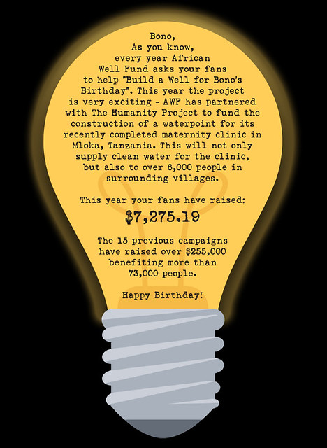
The first day we waiting about 5 hours in the rain by the backdoor where the band enters with the ultimate goal of being able to hand Bono his 2015 African Well Fund birthday card. Not surprisingly none of the band came out.
The next day we again wait about 7 hours this time and finally Bono arrived. He apologized that he couldnt stay long or sign anything but he did it going up to small groups of people at a time. When he got to our area I shoved the card out to him and said something like "Bono here is your African Well Fund birthday card" and he said as he looked at it "I love your stuff" and then he put it under his armpit and moved on. Mission accomplished.
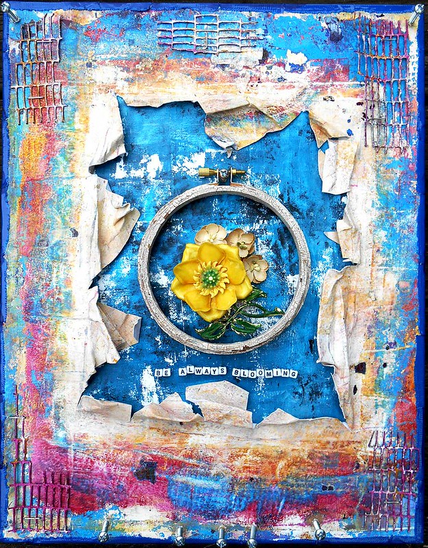
And More Art Journal Pages
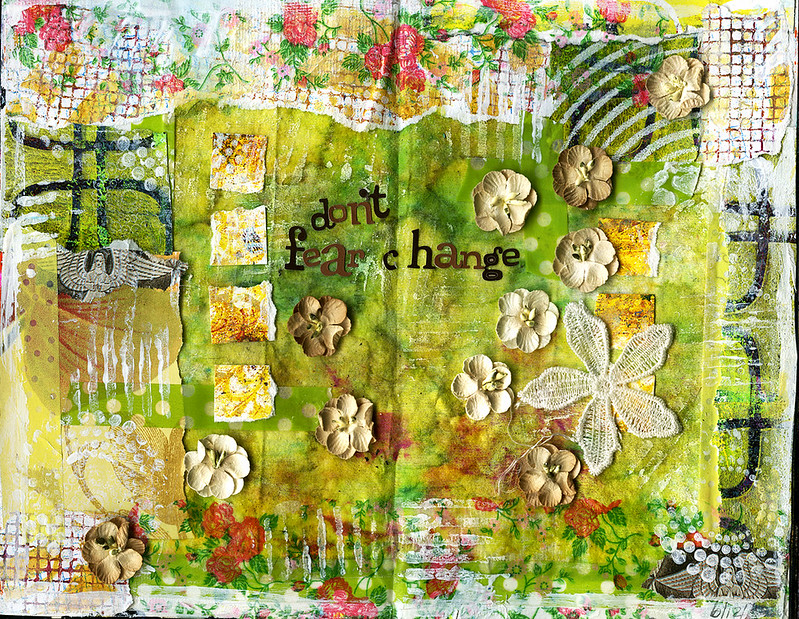
Not a color i use often - green. This background started out as a rag i had used to clean up some splatter or paint or something. Then i kept in the color palette and finished it up with one my favorite themes - Fear. Change brings growth and that is something that definately should not be feared!
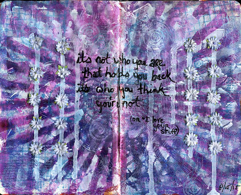
This has been in progress for months now as far as it's a page i wipe off my brush or brayer when it has purples on it. I pulled it together with some stencilling, stamping and ink spray.
This quote is pretty special to me. I've met my hero twice now - Bono - the first time i met him he called me an artist when i handed him a card. This last time he said "I love your stuff" when i handed him another card. I have such a stubborn mental block regarding calling myself an artist and even admitting i have any kind of creative talent. It's hard to think through why - maybe its because i admire artists so much and i still have self accceptance issues, maybe its because artists should do things no one else has done before and i feel like all my stuff is completely derivative of something else. But obviously it's who i'm not thats holding me back from really exploring and accepting myself as an artist!
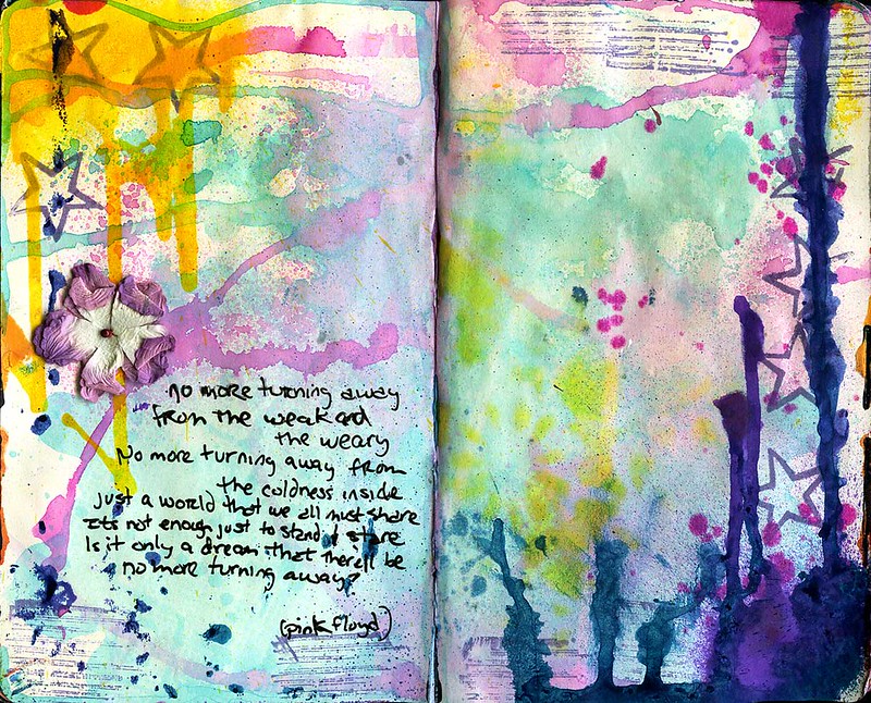
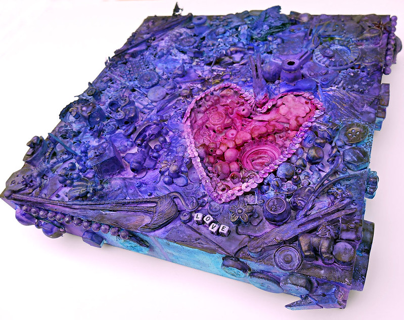
This last page is an ongoing experimentation with different mists at different times. I decided to keep some white space and make it a finished page. I go through periods of listening to certain artists or music genre's on repeat and lately it's been Pink Floyd (again). And i believe "Turning Away" is my absolutely favorite song by them. I thought the page was somewhat exuberant and this verse culminates the song into action from observation. Damn i love singing it at the top of my lungs! It makes my heart swell.
Style Evolution still in the making or last 6 years of cards for Bono
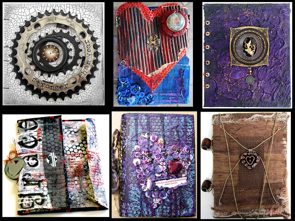
Kind of wanted to see what the last six Bono Birthday Cards looked like if put all together. Because i'm cursed with the "overthinking" gene i was curious what he meant when he said "I like your stuff"
I don't feel like i have a true "style" yet - I'm still looking for that. I also still don't feel comfortable with calling myself an artist OR these cards "art" like Bono and other people have. I just don't know why.
But, looking at these together, and it's literally the last six years of my "artistic" evolution, i guess i can equate my style to bold color ... texture texture texture ... grunginess ... layers...interactive...?
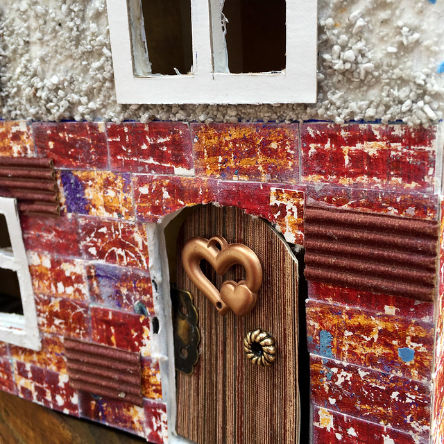
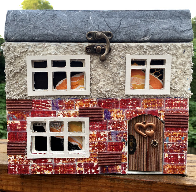
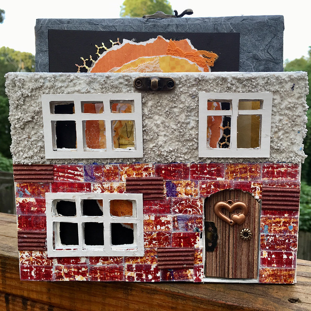
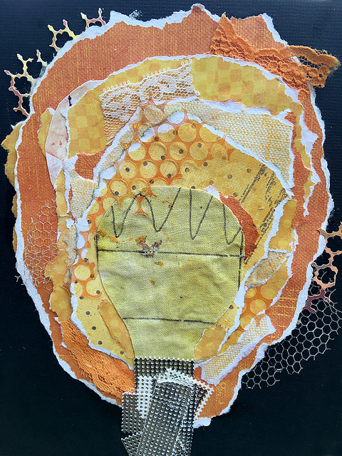
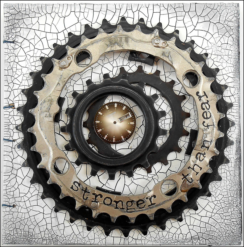
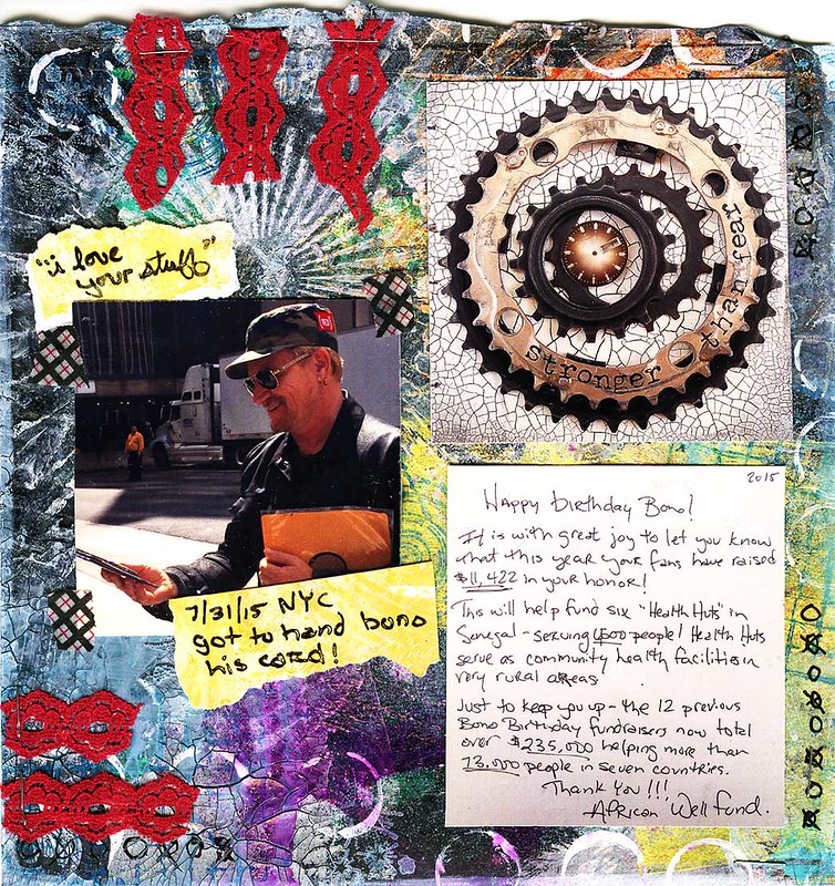
2015 Bono Birthday Card
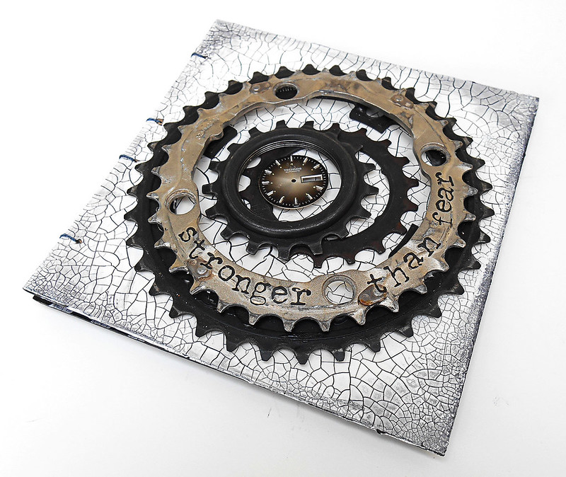
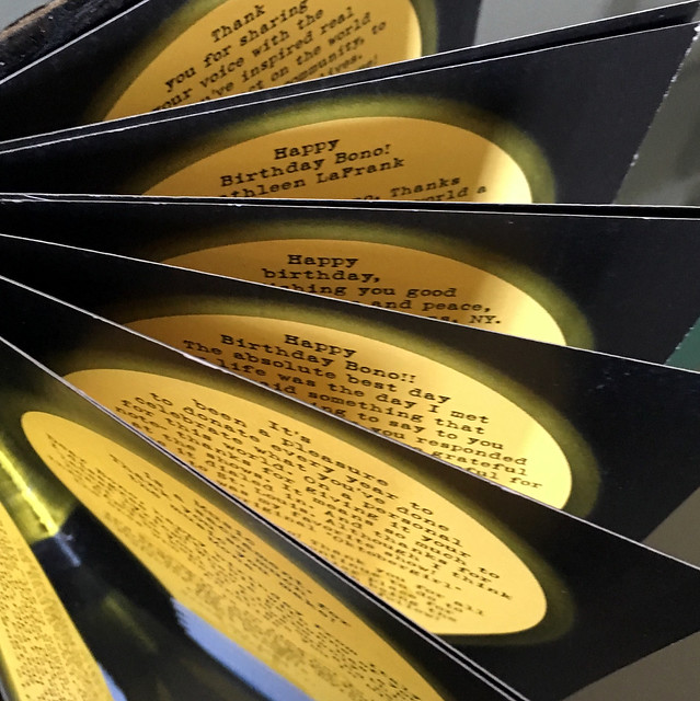
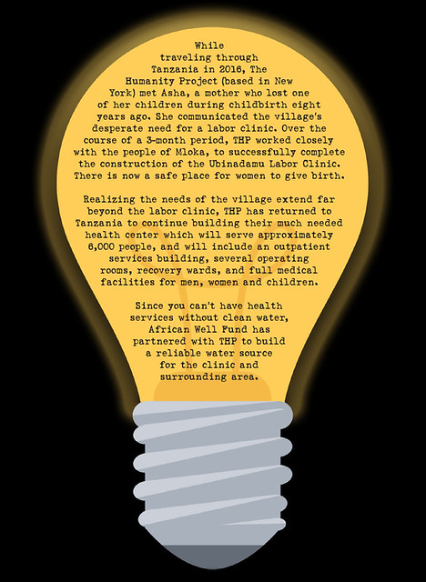
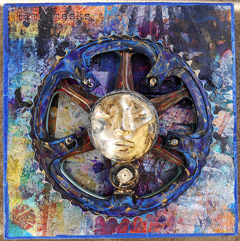
For the 13th year African Well Fund held its annual "Build a Well for Bono's Birthday" fundraiser and again i made the card that housed messages sent to Bono from people who donated to the fundraiser. And this year, i have to say, the card was highly inspired.
When formulating the idea for the card the thought of using bicycle gears not just inspired me but amused me as a tongue in cheek reference to Bono's bike accident last fall.
So, I found some used gears on etsy in various sizes then textured the background with DecoArt crackle paste. I actually successfully got the effect I was hoping! Big cracks in the center fading into smaller cracks to the edges.
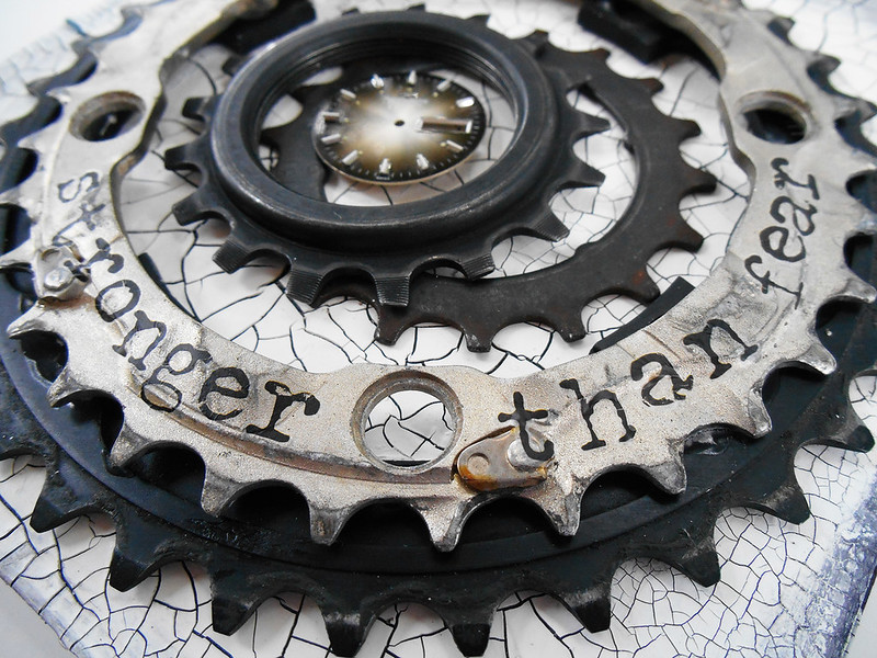
The watch face i had gotten at a flea market. There are several reasons why i added it that was inspired by U2's music. I had just seen two live shows in Chicago of the Innocence and Experience tour and the running theme in both the show and the album is "time". The past, present and future. Acknowledging the good, bad and ugly that happened in the past which because of time can be reflected on to move forward with peace and happiness.
In addition, one of my most favorite U2 lyrics (which is in not one of my most favorite songs), always jumps out at me and haunts me even when i'm not listening to it. It's from the song "City of Blinding Lights" and goes "Time won't leave me as I am ... but time won't take the boy out of this man..."
Lastly the lyric "Stronger than Fear." Where do I even start about this line... it's from the song "Raised by Wolves" and i almost got it tattoo'd on me with the wolf dog Bono drew on my arm. I've been really exploring the idea of fear in my artwork over the last year or so, and try to live my life by the premise that "everything good is on the other side of fear" - so this line in a song about moving past something. "Stronger than fear ... if i open my eyes, you'll disappear" -
After all, fear is a construct of our imaginations.
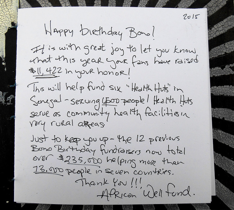
This year i also hand wrote the note ... i think it says everything it needs to say :)
On the back i used a stencil with some light molding paste and for the first time signed my name. In the past I haven't because i didn't want it to seem like it was from me, but this year i decided to sign the piece cause it is so special to me. Plus, i think by now he gets it's from the fans...

