Archive for November 2009
november gauche alchemy circle journal
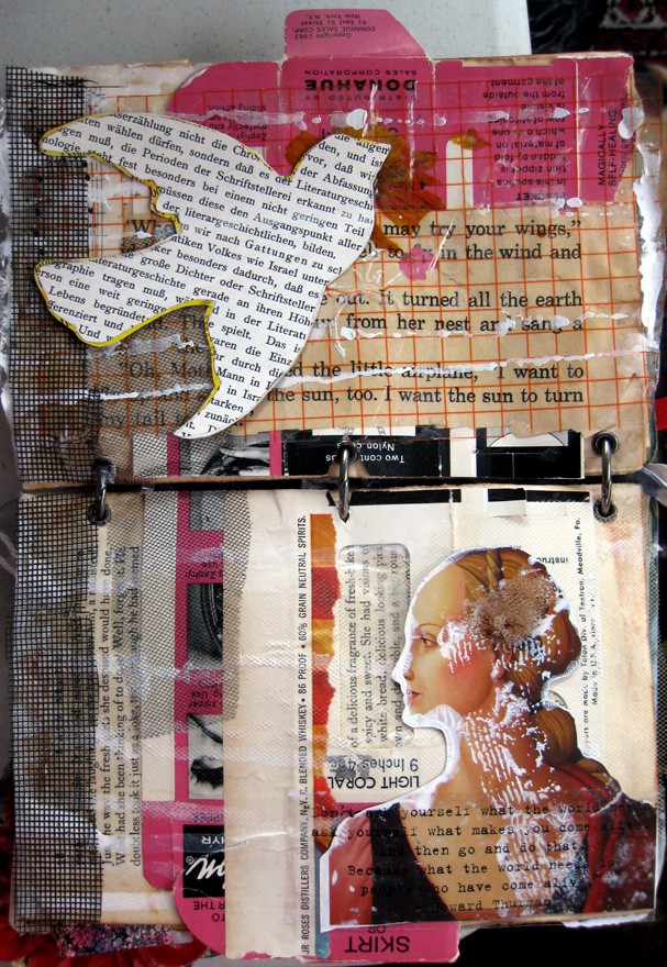
page(s) for the november gauche alchemy circle journal. the theme is "vintage feminist"
this really is more of a mod podge collage than i'm used to doing, but i was just curious to see what a bunch of scraps i had looked like all applied to a page.
The journal itself was made from a book who's spine was cut off and pages glued together to be thicker and stronger. In the collage you can still see some of the original page and text shown through.
The bird was in a bag of a bunch of goodies passed from person to person to pick and choose and use. A massive part of the background is a zipper holder, a plastic bag (orange lined) and screen.
There's a lot of text on the page - the upper page has text cut out from a children's story about a little plane learning how to fly in the sky with the beautiful sun. The bottom page, over the woman, is one of my favorite quotes from Howard Thurman about coming alive and following your dreams. I wanted to kind of juxtapose the notion of freedom and growth against the traditional looking woman and the old zipper for sewing. So, there's a loose story going on here :)
Tag :
Art Journal,
Gauche Alchemy,
TXT post from Gauche Alchemy
Hello, my name is lara, and i'm a font addict.

When hunting for fonts my first stops are usually Font Space or Abstract Fonts. Both let you search by category then sub category then sub category etc to really narrow things down. Font Space has some wicked descriptive categories (tags) since users upload their homemade fonts there and anyone can add a tag:

I mean, how cool is it that if you want to find something with magical butterflies and killer whales all in the same font set you can? (Although there were no gauche tags...hmmm)
Both sites let you type in a couple of custom words and see what they look like in that font. Abstract Fonts has a downloadable catalog but i've noticed it becomes out of date fast since so many new fonts get added so quick.
Another must go to font site specializes in handwriting fonts - Font for Peas. Yup, I'm one of those journallers that HATE my handwriting, although i'm beginning to at least accept it as i have been doing so much art journalling lately. This site has hundreds of REAL handwriting fonts and for a charge you can get your handwriting turned into a font and posted!
Lastly, a site that has saved my butt MANY MANY times in my dayjob is What the Font? You upload a sample of the font you like, or are searching for, and their database gives you matches! And probably 75% of the time i have found the font or something so close to it only a design professional could tell the difference! The only problem with whatthefont i have found, which isn't really a problem *wink wink* is most of the fonts it finds are "foundry fonts" which means you have to pay to use them.
Listen to me ... i could go on for hours about finding fonts. But what do you do when you find them and you're not into digital scrapbooking? Well, i'm sure there are some amazing things out there, but since i don't hold the copyright to them, i'll just show a few from my own gallery, if you don't mind:

Obviously, this is the easiest to do - print an easy to read font out (don't forget to spellcheck :D ), crumple or ink and glue on!

I love the look of sentences cut a part and placed in different angles - adds an extra interest to what's being read, IMHO
As a caveat, I prefer to use laser print outs - that's tonor based. But i also have the luxury of having a laser printer in my office. But tonor isn't water soluable, so if you want to do something with the print that involves water (like some transfers, paint on) you can't use an inkjet who's ink is water based.

Image transfer is pretty easy with packing tape and you don't need to worry about mirror imaging

Lastly, painting over print outs is a easy way to add custom color and make it look "digital." I prefer acrylic paints with lots of water, but water color works well too. If I know i'm going to be painting I use a higher quality paper, one that isn't as pourous as regular office paper. Actually paper made specifically for color copying and laser printers works the best.
So, go and download and create and mix and match! Please leave comments and post to the Gauche Alchemy flickr group any other ways you use fonts - i can't wait to experiment in new and exciting ways!
When hunting for fonts my first stops are usually Font Space or Abstract Fonts. Both let you search by category then sub category then sub category etc to really narrow things down. Font Space has some wicked descriptive categories (tags) since users upload their homemade fonts there and anyone can add a tag:
I mean, how cool is it that if you want to find something with magical butterflies and killer whales all in the same font set you can? (Although there were no gauche tags...hmmm)
Both sites let you type in a couple of custom words and see what they look like in that font. Abstract Fonts has a downloadable catalog but i've noticed it becomes out of date fast since so many new fonts get added so quick.
Another must go to font site specializes in handwriting fonts - Font for Peas. Yup, I'm one of those journallers that HATE my handwriting, although i'm beginning to at least accept it as i have been doing so much art journalling lately. This site has hundreds of REAL handwriting fonts and for a charge you can get your handwriting turned into a font and posted!
Lastly, a site that has saved my butt MANY MANY times in my dayjob is What the Font? You upload a sample of the font you like, or are searching for, and their database gives you matches! And probably 75% of the time i have found the font or something so close to it only a design professional could tell the difference! The only problem with whatthefont i have found, which isn't really a problem *wink wink* is most of the fonts it finds are "foundry fonts" which means you have to pay to use them.
Listen to me ... i could go on for hours about finding fonts. But what do you do when you find them and you're not into digital scrapbooking? Well, i'm sure there are some amazing things out there, but since i don't hold the copyright to them, i'll just show a few from my own gallery, if you don't mind:
Obviously, this is the easiest to do - print an easy to read font out (don't forget to spellcheck :D ), crumple or ink and glue on!
I love the look of sentences cut a part and placed in different angles - adds an extra interest to what's being read, IMHO
As a caveat, I prefer to use laser print outs - that's tonor based. But i also have the luxury of having a laser printer in my office. But tonor isn't water soluable, so if you want to do something with the print that involves water (like some transfers, paint on) you can't use an inkjet who's ink is water based.
Image transfer is pretty easy with packing tape and you don't need to worry about mirror imaging
Lastly, painting over print outs is a easy way to add custom color and make it look "digital." I prefer acrylic paints with lots of water, but water color works well too. If I know i'm going to be painting I use a higher quality paper, one that isn't as pourous as regular office paper. Actually paper made specifically for color copying and laser printers works the best.
So, go and download and create and mix and match! Please leave comments and post to the Gauche Alchemy flickr group any other ways you use fonts - i can't wait to experiment in new and exciting ways!
Tag :
Gauche Alchemy,
Tips and Techniques,
Thank You Art Journal Page - Gutter Girlz
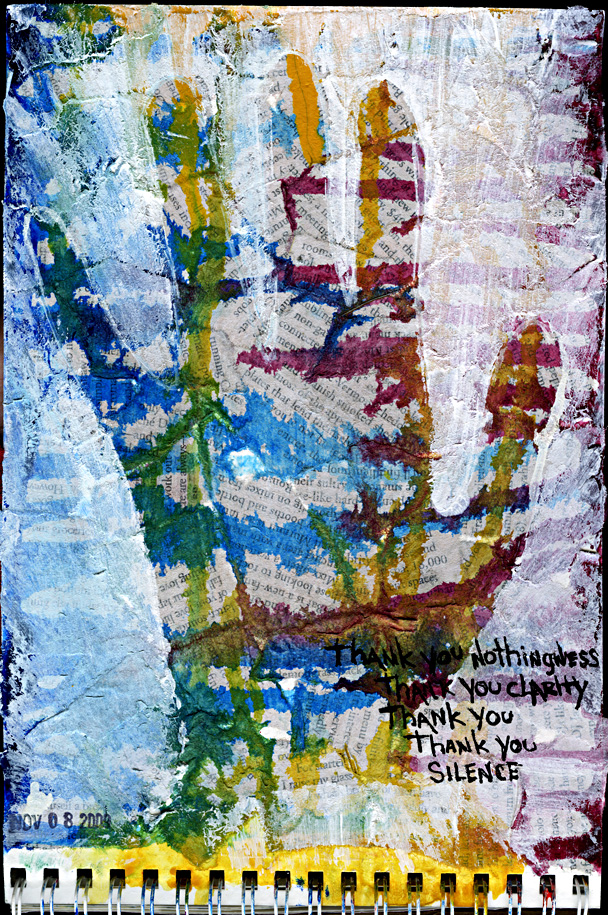
For this month's Gutter Girlz challenge I did kind of a "lift" of an idea i've been enamored with for awhile now. I have this printed out at work and at home - something about it really feeds my soul:
Inspiration
Actually all her stuff is AWWWW-MAZING and completely INSPIRING!
I like how my "version" turned out - I used different materials and related it to the song prompt.
This month prompts are:
THE PROMPT: My Glass
THE SONG: Thank You by Alanis Morissette
PRODUCT/TECHNIQUE: Newspaper clipping
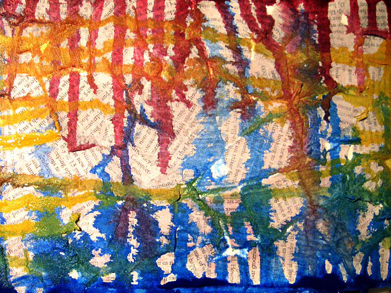
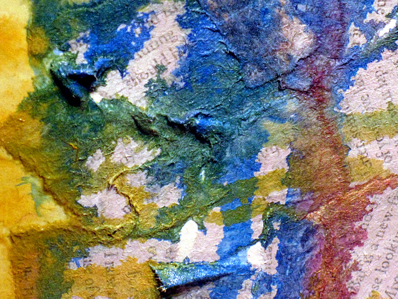
For the background I tore up bits of newspaper and glued them down with modge podge - didn't be super neat about it so i'd have edges sticking up and stuff. I then went over it with a very light coat of white gesso to obscure the text a little but keep the texture. The fun part was dripping the acrylic paint which i cut with water to make it more drippy - man it was exciting to see the color spread in front of my eyes!
Finally after drying time i got super down and dirty and took paper napkin, dipped it in white gesso and ran it over my hand to cause the reverse print.
Here are some background shots before I gesso'd my hand on:
You can totally see how yummy the texture is - i love this effect! I will definitely be using newspaper and acrylic in the future!


Tag :
Art Journal,
Vicarious Art Journal Page
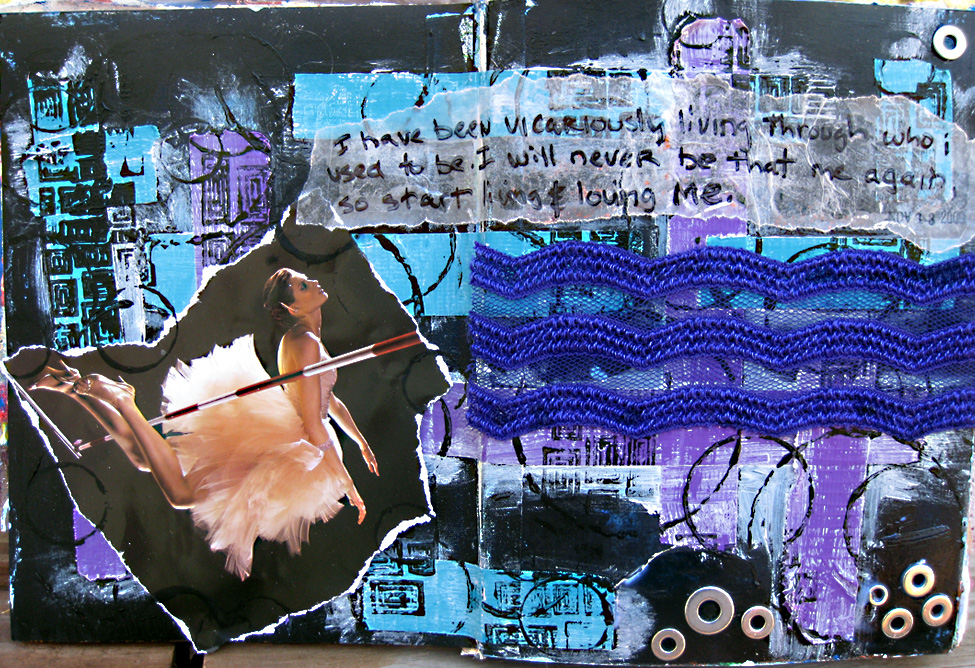
Art journal page for Year in the life of an art journal.
Word is Vicarious
close up:
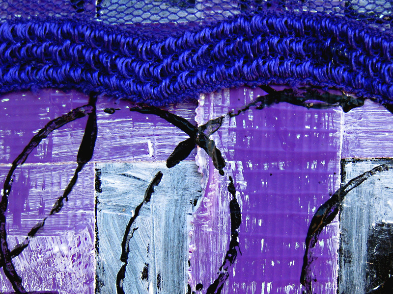
Duct Tape, Gesso and acrylic Paint.
Tag :
Art Journal,
Two art journal pages about ... ummmm ... bono :)
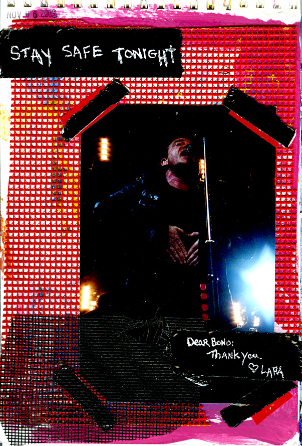
I've had this photo since 2001, someone sent it to me in gratitude of me sending them a U2-inspired holiday card way back when. Instead of it continuing to gather dust in a box, thought i'd pop it on a journal page so I can see it more often :)
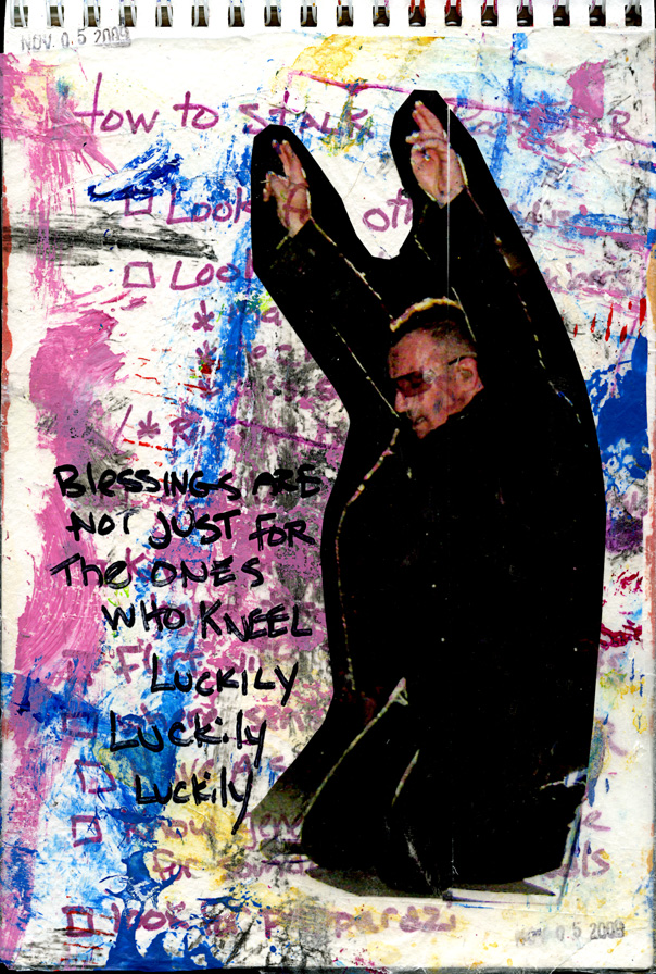
The background of this page was a list i made in NYC when waiting for U2 to either enter or exit the NBC Studios for their SNL gig in September. I was just passing time listing all the ways to stalk a rock star - apparently they don't always work (but sometimes they do). I then covered the list with some used wax paper and did a tape transfer of Bono from a photo I took at the 2nd night at New Jersey's show. The lyrics are from "City of Blinding Lights" which is a song i never cared for whatsoever (hell when they played it at Obama's inaugauration party i was baffled and disappointed) but after seeing their treatment of it during the tour and Bono repeating those lyrics over and over, well i must say it's become a pretty powerful song in my life these days.
Tag :
Art Journal,
Bono,
oh hello gauche alchemy!

my first post for gauche alchemy is up!
no cut and paste - go here to see:
http://gauchealchemy.wordpress.com/2009/11/06/oh-hello/
Tag :
Gauche Alchemy,
Tips and Techniques,
Weekend Art Journal Pages
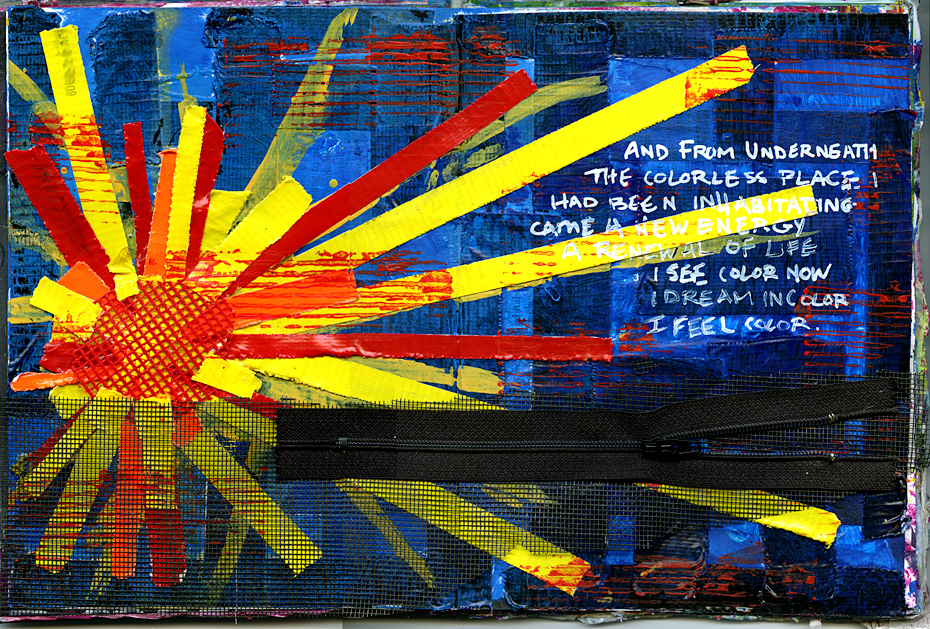
inspired by the "u for underneath" prompt at A Year in the life of an art journal and my love for colored duct tape and paint and screen and zippers.
and from underneath
the colorless place i have been inhabiting
came a new energy
a renewal of life
i see color,
i dream in color,
i feel color.
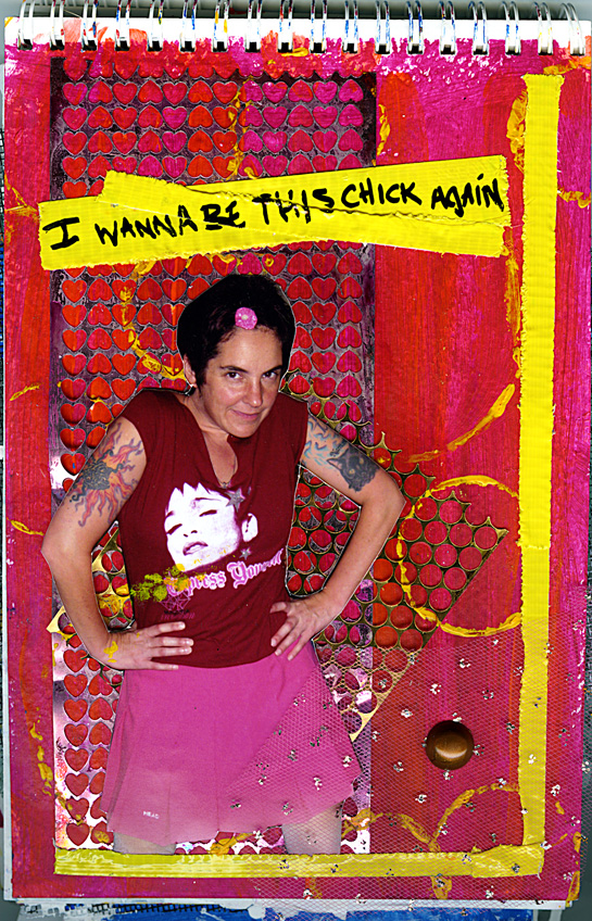
In my "art Journal #2" - i found these photos from when i was shining and skinny and healthy and happy - i thought i'd put one on the page since i tend to look at my art journals more these days than shoeboxes of photos :)
More duct tape and some "punch waste" from a gauche alchemy kit.
Tag :
Art Journal,
