- Back to Home »
- Gauche Alchemy , Tips and Techniques »
- TXT post from Gauche Alchemy
Hello, my name is lara, and i'm a font addict.
When hunting for fonts my first stops are usually Font Space or Abstract Fonts. Both let you search by category then sub category then sub category etc to really narrow things down. Font Space has some wicked descriptive categories (tags) since users upload their homemade fonts there and anyone can add a tag:
I mean, how cool is it that if you want to find something with magical butterflies and killer whales all in the same font set you can? (Although there were no gauche tags...hmmm)
Both sites let you type in a couple of custom words and see what they look like in that font. Abstract Fonts has a downloadable catalog but i've noticed it becomes out of date fast since so many new fonts get added so quick.
Another must go to font site specializes in handwriting fonts - Font for Peas. Yup, I'm one of those journallers that HATE my handwriting, although i'm beginning to at least accept it as i have been doing so much art journalling lately. This site has hundreds of REAL handwriting fonts and for a charge you can get your handwriting turned into a font and posted!
Lastly, a site that has saved my butt MANY MANY times in my dayjob is What the Font? You upload a sample of the font you like, or are searching for, and their database gives you matches! And probably 75% of the time i have found the font or something so close to it only a design professional could tell the difference! The only problem with whatthefont i have found, which isn't really a problem *wink wink* is most of the fonts it finds are "foundry fonts" which means you have to pay to use them.
Listen to me ... i could go on for hours about finding fonts. But what do you do when you find them and you're not into digital scrapbooking? Well, i'm sure there are some amazing things out there, but since i don't hold the copyright to them, i'll just show a few from my own gallery, if you don't mind: 
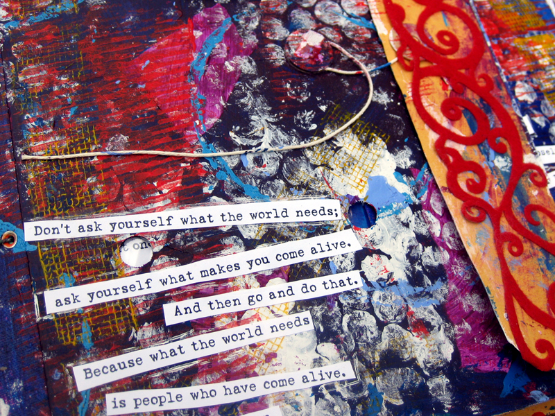
Obviously, this is the easiest to do - print an easy to read font out (don't forget to spellcheck :D ), crumple or ink and glue on!
I love the look of sentences cut a part and placed in different angles - adds an extra interest to what's being read, IMHO
As a caveat, I prefer to use laser print outs - that's tonor based. But i also have the luxury of having a laser printer in my office. But tonor isn't water soluable, so if you want to do something with the print that involves water (like some transfers, paint on) you can't use an inkjet who's ink is water based.
Image transfer is pretty easy with packing tape and you don't need to worry about mirror imaging
Lastly, painting over print outs is a easy way to add custom color and make it look "digital." I prefer acrylic paints with lots of water, but water color works well too. If I know i'm going to be painting I use a higher quality paper, one that isn't as pourous as regular office paper. Actually paper made specifically for color copying and laser printers works the best.
So, go and download and create and mix and match! Please leave comments and post to the Gauche Alchemy flickr group any other ways you use fonts - i can't wait to experiment in new and exciting ways!

Hi,
Just love one of the fonts you found.
It's number 6, just below the fairies.
What is the name of the font?
Please share!
I know Britt!
Fonts are so awesome!
I unfortunately don't remember that font name but i got it at fontspace.com - try searching for it and you might find something even more awesome! :D