Powered by Blogger.
Categories
- Art Journal (85)
- Life Art (72)
- Mixed Media (53)
- Gauche Alchemy (34)
- deep thoughts (28)
- Hipstamatic (26)
- African Well Fund (20)
- Bono (17)
- Hipstamatic Gallery (12)
- Hipstamatic + Mixed Media (11)
- Gelli Prints (10)
- Hipstamatic Travels (10)
- Tattoo (8)
- Greeting Card (5)
- Tips and Techniques (4)
- LifeBook 2014 (3)
- DLP (2)
- Gifts (2)
- Published (2)
- travel (2)
- Quotes (1)
- scrapbook (1)
Archive for October 2008
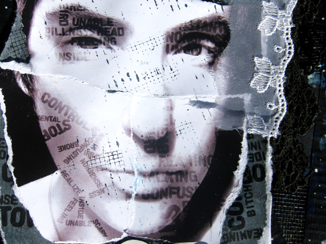
Stop Control - The Creative Type
Another "art therapy" layout.

It's inspired by the 5th Prompt at The Creative Type. The challenge is to fill in a shape with words - i used Photoshop to fill in the dark shadows of my face with words from the journalling that I typed into wordle.net. Don't be surprised if you see alot more layouts using Wordle - HOLY CRAP that site is waaaaaayyyyy too addictive!

Background is layers of tape, scrap paper and pieces of my old screen door with tons of black and blue acrylic paint. The painting was almost more therapy than the journalling :)
The title, Stop Control, were from two words that I seem to keep repeating to myself alot lately. They mean something so different independent of each other AND put together. I seem to keep telling myself to "stop" stuff - stop being irrational, stop being depressed, stop eating like shit and i also keep telling myself to "control" myself - my emotions, my eating, my life.
But when put together, "Stop Control" - if i actually try to stop controlling my self I might be easier on myself and therefore less anxious and overwhelmed. Sometimes giving up a little control is actually good, right? Right....
I also realized when i was done that this layout is virtually entirely black and white. I didn't mean to do that, it just happened. But I think its interesting because I've been so depressed lately that most of my life has been living in black and white. Grey or color areas not only confuse and overwhelm me (i.e. details) but i just can't see them. The little bit of blue I used is the color starting to poke through - I'm definitely emerging back to life these days!

It's inspired by the 5th Prompt at The Creative Type. The challenge is to fill in a shape with words - i used Photoshop to fill in the dark shadows of my face with words from the journalling that I typed into wordle.net. Don't be surprised if you see alot more layouts using Wordle - HOLY CRAP that site is waaaaaayyyyy too addictive!

Background is layers of tape, scrap paper and pieces of my old screen door with tons of black and blue acrylic paint. The painting was almost more therapy than the journalling :)
The title, Stop Control, were from two words that I seem to keep repeating to myself alot lately. They mean something so different independent of each other AND put together. I seem to keep telling myself to "stop" stuff - stop being irrational, stop being depressed, stop eating like shit and i also keep telling myself to "control" myself - my emotions, my eating, my life.
But when put together, "Stop Control" - if i actually try to stop controlling my self I might be easier on myself and therefore less anxious and overwhelmed. Sometimes giving up a little control is actually good, right? Right....
I also realized when i was done that this layout is virtually entirely black and white. I didn't mean to do that, it just happened. But I think its interesting because I've been so depressed lately that most of my life has been living in black and white. Grey or color areas not only confuse and overwhelm me (i.e. details) but i just can't see them. The little bit of blue I used is the color starting to poke through - I'm definitely emerging back to life these days!
Tag :
Life Art,
Broken Heart : The Creative Type

a little art therapy, if you will.
Inspired by the 4th challenge over at The Creative Type - create your own lettering
I used rolled up magazine paper to make the title :)

and of course different paints and textures to apply it with

Tag :
Life Art,
No More Drama: The Creative Type, OLW

I was wanting to do a layout with these song lyrics since they have been my soundtrack this week and then I checked out the latest challenge over at The CrEative TyPe which is to use a quote as your background and thought "PERFECT!"
Then to double it up, I visited another favorite inspirational blog, One Little Word and their word of the week is "More."
So, kinda fortuitous, right?!
The lyrics I did using my favorite font, Love Letter Typewriter. I printed them out in a couple of different sizes then painted over them with thinned acrylic paint. LOVE that technique to death! :)
Anyways, simple fast layout but i think pretty effective. I actually like it, which is saying alot!
Tag :
Life Art,
Dream Out Loud Tattoo

Scrapped the new tattoo.
I've been having so many creative mojo issues lately.
I think the layout looks a little forced, but at least I did it.
Gotta dive back in and just do it, you know?
Most of my scrapbook supplies are packed, so this uses what I could find. The paper is from a pack of Basic Grey Blush the awesome ladies at Ready, Set, Scrap sent me. Of course i didn't pack any of my paint or ink or duct tape! The screen is from a porch on my house that was ripped down and I took out of the trash :) I also kept a small envelope of ribbon and embellishment scraps separate and used some of those. Also a roller stamp from the last Scarlet Lime kit I got.
Lots of layers

